Blog
The Origin and Evolution of the Mythical Jack Daniel's Logo
On the FreeLogoDesign blog, there are many articles about the origin and meaning of several logos of well-known brands. Some companies have been around for over 100 years, while others have a mythical side. Today, we are going to analyze a brand logo that meets both of these criteria. Let us introduce you to the origin and evolution of the Jack Daniel's logo.
A few words about the history of Jack Daniel's distillery company and its founder
What exactly do we know about Jack Daniel? First, his real name is Jasper Newton Daniel, and as you might expect, he is from Tennessee in the United States. Coming from a large family, Jack began working at a young age for a family friend who made whiskey. It was there that he learned the trade and a few years later, he bought it all to found his own distillery in 1866. One of Jack Daniel's big changes would be opting for a square bottle that would become one of the brand's most distinctive elements.
After Jack Daniel's death, the company faced great challenges due to the Prohibition and Great Wars. However, from the 1950s onwards the distillery became a hugely successful brand, becoming a well-known brand across the country, especially with several celebrities such as Frank Sinatra and popular music groups.
What type of alcohol is Jack Daniel's?
Over time, Jack Daniel's Distillery would release different whiskeys and recipes to please the many liquor lovers. It is one of the oldest distilleries in North America still in operation and certainly one of the most popular Tennessee whiskeys around the world.
The first Jack Daniel's emblem
What is the meaning of the Jack Daniel's label?
It is difficult to say what Jack Daniel's distillery first logo was because, at the time of the company's founding, it was not yet very common to use an image to represent a brand. The name of the distillery was stamped on barrels, jugs, and bottles directly. In the 1880s, the inscriptions Old Time Distillery, Old No.7, Jack Daniel, and Lyncheburg, Tenn. were engraved on the glass of the bottles.
In the following years, various labels were added to whiskeys, many of which resembled the logo we know today. However, in 1950, the distillery opted for a common label for the bottles, a real brand logo, at the time when Jack Daniel's was beginning to experience great success.
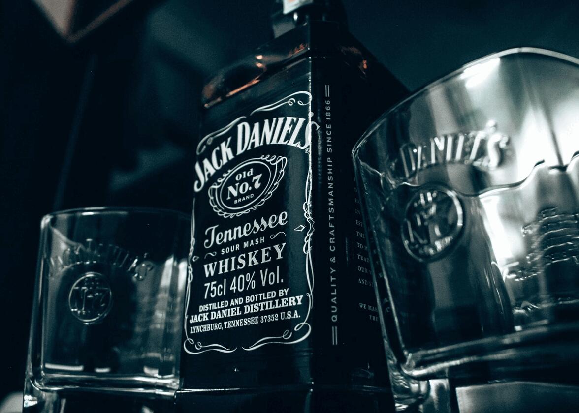
The first real Jack Daniel's logo from 1950 is very similar to the current version. Still, with the shape of a label, we could consider the whole thing as a badge logo given its rectangular shape. As for the colors, it's minimalist, because they only used white and black. This is the only simplistic thing, however, because the logo includes several components.
In addition to the small spiral pattern decorations that are all around the bottle, there are several distinctive components. On the first official Jack Daniel's logo, the name of the brand with the mention Old Time is in the upper part. Then, there is a badge decorated with the name of the whiskey itself, in this case, the Old No.7 brand. Underneath is Quality Tennessee Sour Mash Whiskey and distillery information. At least three different fonts were used on this version, and it would be used until 1990.

It is true, however, that it can be considered that it is only the brand name that makes up the logo. In this case, it's a much more flexible signature logo as it can be used on its own. The font used is Jasper, a typeface whose name is a tribute to the founder of the brand.
The evolution of the Jack Daniels's brand over time
The Jack Daniel's logo has undergone some changes over time. It's nothing major since the main components of the brand are present regardless of the version.

In 1990, the distillery made changes to their famous logo. They kept the various inscriptions and despite the limited space available, they added a mention of the quantity and percentage of alcohol. The dimensions of the rectangle and some of the text also changed slightly.
Then, in 2011, Jack Daniel's did another redesign. This time, as the brand was very well known, they took the liberty of removing some texts. They kept the small decorations all around the rectangle, Jack Daniel's name, and the Old No. 7 badge which remains the heart of the logo. The amount and percentage of alcohol disappeared, as well as some information about the distillery. This version is much more streamlined.
As we know, to survive, brands often have to reinvent themselves. Since 2010, Jack Daniel's has released several new Tennessee whiskeys with different tastes. To differentiate themselves from the classic No.7, the brand opted for the use of new colors for the label and logo. For example, for the honey version, the color of the label is pale yellow, while red is used for the cinnamon version.
How to Get Inspired by Jack Daniel's When Creating Your Logo
If you're looking for inspiration for your logo, there are some components of the Jack Daniel's brand that can certainly give you some ideas. However, before we get started, it's essential to mention that we do not recommend using so many different texts and fonts. In the case of Jack Daniel's, it works because it's a brand that's been around for over 100 years.
Regardless of the version, Jack Daniel's was able to rely on a strong color contrast, with black being used as a background. This has a very interesting effect. Also, putting the company's name at the top makes it easier to promote it. Also, feel free to create different versions of your logo when you release special products.
More tips and tricks on the blog