Blog

5 logos we love and why
A few months ago, we presented 6 criteria of a great logo, to help you in your creation, and hopefully, it did. To follow up on this article, we showcase 5 logos we love, and why these logos work well according to those 6 criteria.
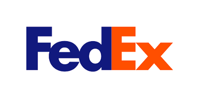
1. FedEx
The FedEx logo is one of my favorites ever since I learned about the arrow on the E-X side. Few people noticed this detail in the logo, but once we see it, we cannot unsee it. The integration of the arrow is ingenious yet simple and without any doubt, effective. It also has a good use of colors and font, and we find ourselves with an extremely effective logo that has been solid through the years, since 1994.
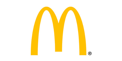
2. McDonald's
The McDonald's logo is one of the best known on the planet. There must be a reason behind this, other than the delicious burgers. Indeed, the golden arches are timeless and easily recognizable. The choice of colors is also very effective since yellow reminds people of happy and dynamic places. In addition, the color and shape of the arches allude to the fries they serve.
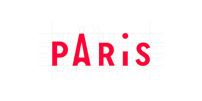
3. Paris Tourist Office
Ingenious, the Paris tourist office logo incorporates two symbolic icons while remaining simple. We find in the signature a graphically simplified version of the Eiffel Tower, as well as an I. It holds all the criteria for a good logo that we shared with you. It is simple, flexible, but still has a great personality and is timeless. The chosen color captures the attention and harmonizes well with the city of Paris.
4. Nike
We've already introduced it, the Nike logo has a great story. But, it is his simplicity that propelled him where he is today. The swoosh has incredible retention thanks to its simplicity. Only one form is able to make us feel the movement, as well as the speed and through the years, and it’s the Nike’s swoosh
5. Amazon
Just like in the FedEx logo, the Amazon logo has a somewhat hidden meaning. What seems to be a smile in the eyes of many is actually an arrow that goes from A to Z, to tell clients that you will find everything you need. This hidden message in the logo brings a second level of understanding and also a lot of personality. This, combined with its simplicity and timelessness, makes it extremely effective and memorable.
What is your favorite logo?
More tips and tricks on the blog

