Blog

3 Successful Logo Rebrand Stories
There are not only unsuccessful logo and brand redesigns but successful ones as well. In the past, many businesses, with their big marketing teams or not, have been able to distinguish themselves by updating their outdated or ordinary logo. As mentioned in our article 3 Rebrand Stories that Did Not End Well, people are often reluctant to change and find a certain comfort in the brands they know. What can we do so that our customers like our new image? Here are 3 rebrand stories that went well. We suggest you study them carefully if you want to update your brand this year.

A more modern logo for Instagram
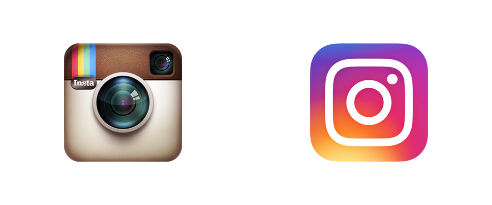
You may have been shocked in 2016 when you thought you had lost your Instagram application on your phone. The application did not disappear; in fact, its logo changed in a drastic way. The small square logo depicting a vintage Polaroid camera represented the company for more than four years before being updated. During the transition, the rainbow and the leather were abandoned for a simpler and more modern logo with a colorful background. It is certain that this new look had people talking.
As the trend of 2016 was minimalism, Instagram’s officials felt it was time to aim for a stronger image. As mentioned by Ian Spalder, Instagram’s head of design, "the Instagram logo and design was beginning to feel, well… not reflective of the community, and frankly we thought we could make it better." Moreover, the application also had evolved to become more than a simple photo-sharing service, although it is now estimated that there are more than 80 million pictures shared daily. Instagram also took advantage of this chance by bringing some modifications to the platform itself. At first, many probably disagreed with this change; however, most of them must have now forgotten about the older logo. In addition, with the huge amount of apps we now have on our cell phones, the fact that Instagram managed to create something unique and recognizable at first glance must have helped increase the number of daily users.

A younger look for The Huffington Post
You might have heard of the online newspaper The Huffington Post. Founded in 2005 and later translated in many languages and distributed to different countries, the company had a second wind when the founder, Arianna Huffington, decided to leave in 2016. Their first logo was traditional and ordinary as it looked like a print newspaper logo. The Huffington Post perhaps was hoping to convince people that their online newspaper was as serious as a printed one. Their logo was simply made up of their name in a forest green color with a sans serif font.
The online newspaper did not settle for just changing their logo in 2017. The company changed the logo’s image and their name for a shorter version, HuffPost. The visual elements of the logo were replaced with the use of a bolder, italic, and sans serif font. The Huffington Post head visual directors, Julia Beizer and Alison Zack, summarized their experienced that way: "We think our new logo does just that. We fell in love with the new typeface (National, for all you font nerds) because it’s strong and a little quirky. The bold italic carries the eye forward, in the same way our brand has grown and evolved over the last 12 years." It is obvious that this rebrand refreshed the company’s image, as well as making it unique and more accessible. The logo has also become more interesting than most other newspaper logos.

A unique image for Airbnb
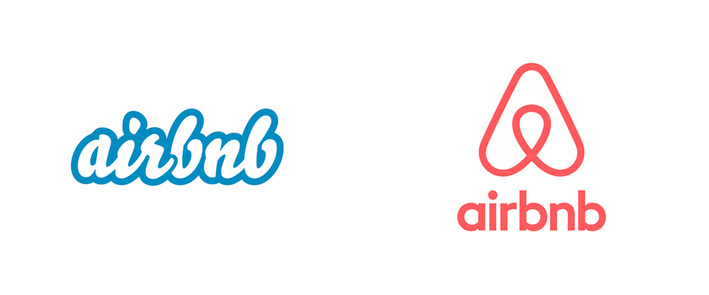
Do you remember what the older Airbnb logo looked like? Probably not. The business which is known for its problems with many judicial authorities around the world decided to bet on a new and unique brand in 2014. Airbnb was then present in more than 34 000 cities and 190 countries at that time. Moving from a logo only made up of their name with the Bello font and a blue contour, the British agency DesignStudio used four different elements to get inspiration for Airbnb's new image: people, places, love and Airbnb's first letter. As well, DesignStudio sent some of their employees to try out their client's hospitality in different cities.
And then what? Much more than a logo, this unique symbol is simple and sophisticated. Nicknamed the Bélo (not to be confused with the first logo font), Brian Chesky, Airbnb's co-founder, said that their new logo was conceived in order to represent the notion of belonging. Lineteo Brown was chosen to be the font for the name of the company on the logo. Furthermore, the Rausch tint, which is an orangey pink that looks a lot like Pantone’s color of 2019, now follow the Bélo in its adventures. Thus, the more a logo is simple, the more it is usually recognizable. Airbnb's new image is not an exception.
In conclusion, Instagram, The Huffington Post, and Airbnb successfully changed their logos because they know their clientele. They also are three businesses that are very popular with younger generations; consequently, your logo will help you increase your popularity if it is unique and modern. There are of course more than three successful logo rebrand stories and we might see some in 2019. Do not hesitate to tell us which ones are your favorites in the comments!
Images: UnderConsideration
More tips and tricks on the blog


