Blog
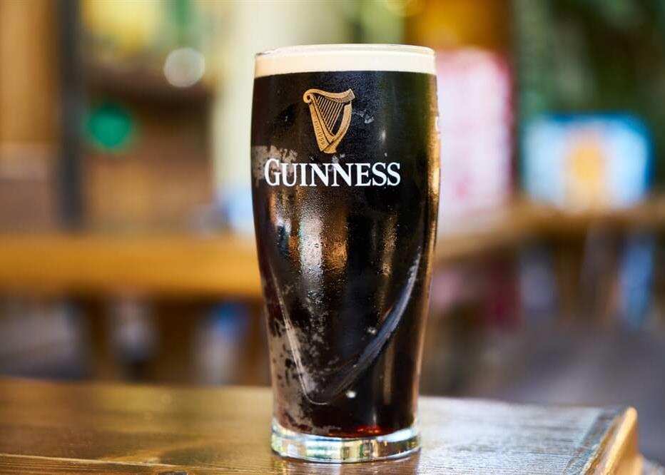
The History and Symbolism of the Guinness Logo
When you think of Ireland, what exactly comes to mind? Is it green hills, redheads or four-leaf clovers? There is also an Irish drink that has distinguished itself on the international stage and has become one of the symbols of this country: Guinness beer! Whether you like this stout or not, you can't separate Guinness from your country of origin. Today, we are going to take the time to explain where this logo came from, as well as the symbolism behind it.
A few words about the history of the Guinness brewery and brand
Guinness was founded in 1759 by brewer Arthur Guinness. He decided to start his brewery in a shutdown building in a low-profile area of Dublin. The founder then made an amazing deal with the city. He rented the place for 45 pounds a year for 9,000 years. Guinness then specialized in stout, a beer that is recognized for its dark, almost black color.
Then, decade after decade, the company exported its beers throughout the British Empire, and then around the world becoming the most famous stout. This is due in part to a good quality product, a strong brand image and advertising campaigns (using the famous toucan bird at times) since the 1940s. As well, the harp symbol as a logo was used as early as 1862, making the Guinness logo one which has been able to stand the test of time.
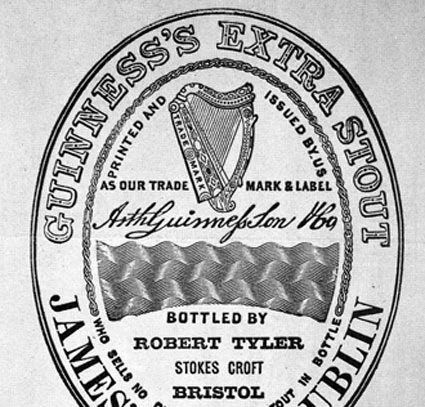
Guinness' original logo and meaning
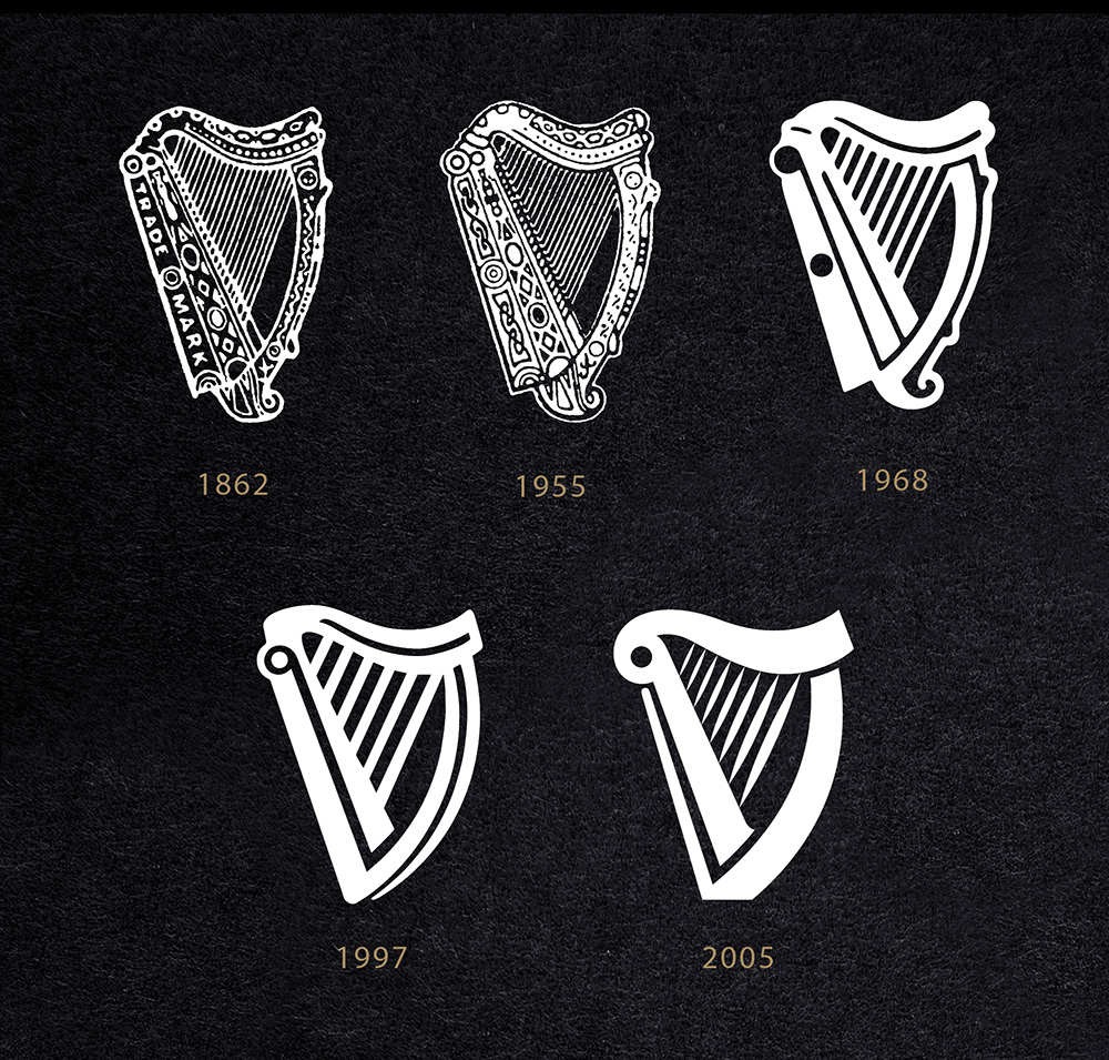
As mentioned above, the first Guinness logo was used as early as 1862, although it became a registered trademark in 1876. The logo was then composed of the name Guinness, the signature of the founder, and a harp where "trademark" was written. The harp then had many small visual details. The original logo quickly allowed the Dublin-based company to be noticed wherever it was exported. In 1858, Guinness beer could even be found in places as far away as New Zealand!
What is the symbol of Guinness beers?
The Symbolism of the Harp in Ireland
Before moving on to the various Guinness brand logos over the years, the importance of the harp as a symbol of Ireland should be discussed. It is a symbol widely used in the history of this country. First, it is a Gaelic musical instrument. One still exists today which belonged to King Brian Boru according to legend. This figure is known as the first ruler to unify Ireland against the Viking occupation. Since then, like the clover symbol, the harp has been a common emblem to represent this country, whether for its coat of arms or on its coins.
It should also be mentioned that this symbol was used by the instigators of the 1916 revolt, and then as the official emblem of the country when the state of Ireland was created. However, the new Irish government of 1922 encountered a major problem since Guinness had already been using the harp as a trademark for 50 years. Since this musical instrument symbolized the unity among everyone of Ireland, they decided to use the symbol of the harp in spite of everything, but in reverse to the logo of the brewery. Subsequently, other Irish companies began to use other versions of this famous harp for their logo, including the airline Ryanair.
Why is the Guinness mascot a toucan?
If you have visited the Guinness Gate Brewery in Dublin, you might have seen some older ad campaigns with a toucan. Why so? The choice of a toucan as the Guinness mascot is rooted in the brand's historical marketing strategy. The company introduced the iconic Toucan as a symbol of the beer's exotic and adventurous nature. Additionally, the use of a tropical bird helped create a memorable and visually striking image for advertising purposes. It surely was a way to stand out for other Irish breweries and beers.
The Guinness Logo Designs Over the Years
The Guinness logo has undergone some redesigns since its inception, but it is still quite similar to the original version. These redesigns have been combined logos as they are normally composed of the symbol of the harp with the company name. The first major overhaul took place in 1955, almost 100 years after the creation of the original logo. The word "trademark" was removed to add other details and the colors were reversed–white as the accents and black as the background.
In 1968, the company began to use a simplified version of the logo where the details on the instrument disappeared. The number of strings also decreased to only nine. In 1995, a version inspired by the last two logos was created. The removed details were back but simplified. Unfortunately, this was short-lived as the company redesigned its image in 1995 with an even more simplified version of its logo without any details. A new, more refined version was also created in 2005. However, it should also be noted that the year the company was founded is often written on the logos, regardless of the redesign.
The Guinness logo fonts
The font used for the Guinness logo has also evolved over the years. From the first font of the original logo to the current font, there have been several redesigns and changes. Until the latest version, the company seemed to favor serif fonts–perhaps to give a more historical look to the brand image. Otherwise, the font currently used has a very light serif font that is accentuated at the end of each letter. It is also a custom-made in-house font for this internationally renowned brewery.
In conclusion, don't hesitate to take inspiration from the Guinness logo when creating your own logo or redesigning it. Why not use a known symbol of your area for your logo like Guinness did? The legends and mythology of your country may inspire you. For example, did you know that the Nike logo was inspired by the Greek goddess of victory?
More tips and tricks on the blog

