Blog

How to Introduce Your New Logo
Every year, many companies introduce a new logo. For some it is a success. For others it is a complete failure. What makes the difference? These companies often spend large amounts of money on redesigning their logos working with big agencies. So, what can you do to successfully introduce your new logo? Here are a few steps to follow so that the odds are on your side.
No One Likes Change
Before we begin, we want to remind you that people generally don't like change. So, you should keep in mind that people may be dissatisfied when you introduce your new logo, even if it is the most extraordinary. This is even more true if you've had the same brand image for a while. Or, if your customers have been very attached to your business for a long time. That's why it's important to introduce your logo redesign in the best way. Know that people need time to get used to your new brand image.
Creating a Perfect New Logo
When your business evolves, it's normal for your logo to change over time. But don't do what Yahoo! did. They had more than three major logo redesigns in less than 10 years. When you feel that your brand image no longer matches your company or you want an update, this usually means you are ready to redesign your logo. There are different ways to do this. Here are some tips to help you with this creative process.
- Analyse your company's current values.
- Analyse your target audience and their needs.
- Keep a guide of your old branding (colours, shapes, fonts, atmosphere, etc.)
- Get inspiration from the current trends for logos.
- Have an open mind and try different versions of your logo.
For example, here we have a logo that could have been created for a law firm in the early 2000s. There are several elements that are no longer current. As well, even though the shading is on trend, there are too many colours.
For the redesign, we decided to take some elements from the original logo. Mostly the scale icon and the same shade of blue. We wanted to simplify the logo to give it a touch that is more current and professional. These small changes can make all the difference.
Testing the Redesign with Customers
Once you have completed your redesign, why not test it with customers before unveiling it to everyone? Your customers' opinion from your test will give you the opportunity to make adjustments if needed. You could also involve your best customers or ambassadors in this testing process. This will increase their attachment to your brand. However, we would like to warn you that in the past, large companies have used customers to test changes that ended up not being well received by everyone. It is therefore very important to choose testers that represent your target audience.
Prepare Your Customers by Telling Them
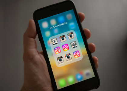
It is wise to say in advance that you are working on a new logo. You don't have to say any more. This will prepare your customers for the change. You can also organize an unveiling to explain why you felt you needed a new brand. Many companies choose to change their logos without warning anyone which can upset customers because they don't understand what's going on. That's what happened when Instagram and Spotify decided to update their logos. When this happened, customers were lost and couldn't find their app on their mobile phone.
Be Open to Comments to a Certain Extent
As mentioned above, your customers may not welcome the idea that you have a new logo. There may be a lot of criticism; however, if you feel that this is a logo that represents your business well, you must stay the course – even if it is difficult. Let the dust settle, most of the time people will come around and get used to the change. However, take the time to listen to what your customers have to say, as they can raise important points that you may not have thought of. These points could be useful in another redesign. And if you've made a mistake, be honest and just admit it.
Mozilla Firefox: An Example to Follow
We liked Mozilla Firefox's approach to their logo. They said they were looking for a new brand and showed different options to their community as early as 2018. In 2019, the new logo and the sequel were officially revealed. We also find that this is a magnificent redesign that respected the visual identity of this web browser.
Discover Our Article, 3 Successful Logo Redesigns
In conclusion, it takes a certain amount of courage to redesign your logo, especially if you have had it for several years. You will have to work hard to find a symbol that is both current and that represents you well. Don't forget to keep a guide of the different versions of your logo so that it can be easily recognized regardless of the variation. Then, test the versions. All the best success!
More tips and tricks on the blog


