Blog

The History Behind the Burger King Logo
If you are opening a restaurant, in addition to offering delicious dishes, you will need to make sure you have a strong brand image. Yes, the restaurant industry is a very competitive world. So, you need a logo that's both effective and enticing! We have already looked at McDonald's and Subway's logos, now let's take a closer look at the history and evolution of the Burger King logo! The Burger King logo will no doubt help you find inspiration, whether you want to launch a new food chain or an international corporation.
A few words about Burger King's origins
Who created Burger King?
Burger King is an American company that has been around since 1953. Founded in Florida by Matthew Burns and Keith J. Kramer, the pioneering restaurant was then called Insta Burger King. The company was purchased in 1954, and its name changed to Burger King. The fast-food chain then expanded to Puerto Rico, and then to Canada a few years after its launch. And today, it is in more than 50 countries. Known primarily as McDonald's rival, Burger King has been banking on a strong king-centric brand image as a mascot. In addition, it is one of the most popular food chains in the world today, making several billion dollars in sales each year. Most restaurants are located in the United States.
Burger King's first logo design
What is the story behind the Burger King logo?
When Insta Burger King became Burger King, they needed a logo design. The original logo was a wordmark logo, a logo based only on the company name. Burger King was then displayed in a thick, black, stylized font slightly reminiscent of the Flintstones. Fortunately, this logo was used for only 3 years. Burger King needed a logo design that could stand out if they wanted to break into the North American market and get more franchises.

The Burger King symbol evolution through the years
Why did Burger King change its logo and have rebrands?
In 1957, Burger King made the first redesign of their logo. They opted for a combined logo, a logo with the company name and an icon, which was much more complex than the first logo. It was definitely not a logo design that we would see in 2021 – the trends being simplicity and minimalism. In short, Burger King's 1957 redesign consisted of a drawing of a king sitting on a burger holding a soft drink in his hand. Below was the company name in a font similar to the original. The difference was that the font was softened and the color palette. The logo also included the slogan Home of the Whopper.
Source: logo.fandom
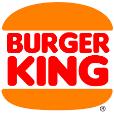
As we mentioned in our article Why Slack Changed Their Logo, the more elements on a logo, the harder it can be to reproduce it. In 1969, the Burger King logo underwent a major redesign, all the elements of the logo were thrown in the trash. That's when the logo that most people know today was created. This one was made up of the name of the company in a thick, red, font, with yellow halve circles above and below, and it reeked of the 70s. This ensemble was meant to make us think of a hamburger, Burger King's best-selling and well-known meal. The result was simple, but very effective. There would be a slight redesign of this logo in 1994. The font was changed to a more modern one. The color palette was also slightly modified. It should also be noted that the 1969 version of the logo recently appeared in the hit series Stranger Things.
What was the Burger King logo in 1999?
With the arrival of 1999 – a new millennium, came a new company logo. Burger King did a major redesign of its logo while keeping the main elements of its brand image. The name of the company was kept in red but tilted for more dynamic look. The bun halves were also slightly reduced in size. It was above all the arrival of a blue circle around the logo that was the big difference compared with other versions.
A new Burger King emblem and brand for 2021
One of the main trends in 2021 is nostalgia. These are more difficult times, and many people remember how good it was in the good old days. Burger King understood that people were looking for comfort and decided to present a brand-new logo for 2021 based on the 1969 and 1994 versions. This was mostly a minor redesign, mostly a nod to their first logo. We find once again a hamburger whose middle is the name of the company in thick, bold red lettering. Of course, this adds a retro touch to the brand image, but many designers say it's an innovative or even easy redesign. Only time will tell whether this return to the past will be profitable for this American chain.

How to get inspired by Burger King when creating your logo
Like Burger King, it's important to identify current trends to create a fashionable logo and friendly emblem. The company has not had to make dozens of redesigns like Pepsi and has often kept the elements of its brand image when creating new logos. Also, know the meaning of colors. Yellow, orange and red are often colors associated with the world of food. Then, keep it simple. Don't use too many visual elements or colors to keep the end result harmonious, easily recognizable and reproducible.
In conclusion, whether you like Burger King burgers or not, this article has made us hungry! Have you ever thought about using orange for your food-related company logo? Be aware that this is a color palette that is still not used very much in corporate branding. Happy creating!
More tips and tricks on the blog


