Blog

The Origin and History of the Walmart Logo
When we think of the world-famous large American companies, we often think of web giants like Facebook, Apple and Microsoft. There is, however, another company that knows how to generate billions of dollars every year: Walmart. So, how was this company founded? Let's take a closer look at the origin and history of the Walmart logo.
A few words about Walmart
How did it become such an important company?
In 1962, Walmart was founded by Sam Walton in Arkansas, USA and has become today one of the largest distributors and employers on the planet. From the beginning, the founder had an idea in mind. They wanted to open as many stores as possible and negotiate the best possible deals with suppliers. It was also reducing their profit margin in the hope of quickly gaining market share. That way, they can offer prices that are often cheaper than their competitors. Six years later, they expanded outside of Arkansas, creating stores in Missouri and Oklahoma. In the 90s, Walmart left the United States to establish themselves in Mexico, Canada, and in various countries in Europe and Asia.
Today, Walmart has nearly 11,000 stores around the world – mostly located in North America. They are one of the most lucrative companies in the world with a turnover of more than 500 billion in 2020. That means you have probably already seen or heard of this retail giant.
Walmart's first business logo
What does the Walmart logo symbolize?
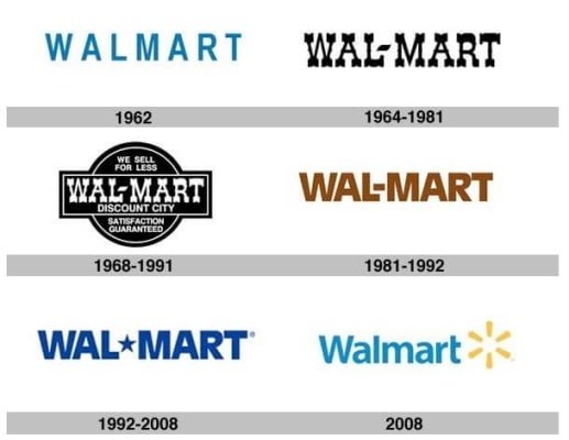
But what about Walmart's first logo? Strangely, it looked a bit like the current logo. Walmart's first logo was a wordmark logo, a logo consisting only of the company's name. A relatively simple blue sans-serif font was chosen. This logo was only used for two years.
The evolution of Walmart's logos over the years
Why did it rebrand? What is Walmart's brand message?
In 1964, a new brand image was born for Walmart. First, the name changed slightly to Wal-Mart, but the most drastic change was the font. A very pronounced western look was then chosen, which is an element that may be related to the fact that the company is from Arkansas. The blue was also removed to make way for black. A few years later, this logo was simplified. It was made into a badge-logo and phrases related to the company were added: We sell for less and Satisfaction guaranteed. This logo would be used for more than twenty years.
In 1981, we got a logo a little more neutral, the western effect disappeared. This redesign came at the same time the company wanted to establish themselves outside the United States. Walmart decided to opt again for a signature logo and a sans-serif font. All the letters were capitalized. The color at this time was brown. In 1992, Walmart decided to change the color to blue. As well, instead of a hyphen, a star was added. The font remained the same.

Finally, in 2008, there was a major redesign. Walmart wanted to change their brand image with a new logo that was, this time, a combined logo. A yellow icon resembling a sun was added to the right of the company name. Wal-Mart also became Walmart again and a lighter blue was chosen. The letters also changed from uppercase to lowercase, but they kept the sans-serif font. The effect seemed more friendly and accessible than those of the former logos of decades past.
What is Walmart's new logo font?
As we mentioned in many articles, a lot of important brands opted for sans-serif fonts recently. The reason is simple: sans-serif fonts are considered to be more accessible and friendly. Therefore, it works for companies like Walmart because it targets a wide clientele. Since the 2008 rebrand, Walmart has been using a new font. Designers seem to say that the font used could be Bogle or Myriad.
How to get inspired by Walmart's emblem to create your logo
There are several elements of Walmart's logo story that can inspire you when creating your own logo. First, let's talk about color. Colors are one of the most important elements of your logo, as they have very special meaning. According to our page on the meaning of colors, blue is a color widely used for company logos, because it is a color associated with trust and accessibility. It is also a color that is loved by most people. Also, make sure you have sufficient contrast between the different colors of your logo. For example, Walmart chose to add yellow, a complementary color to blue when creating their new logo.
Then, when creating your logo, remember that you can be inspired by your region and its distinctive elements. In fact, as early as 1964, Walmart decided to present a western and rural side by choosing a very decorative font. It was directly related to where the company was founded. Walmart isn't the only company that was inspired by their home region when they created their logo. For example, the Red Cross logo and BMW drew inspiration from their homeland to create a logo that represented them well. In addition, if your logo has been around for more than a decade or it seems outdated, do not hesitate to think about redesigning it to be in line with new trends. Remember that Amazon's original logo had a river on it.
In conclusion, Walmart has distinguished themselves by offering large stores, competitive prices and a relatively simple but effective brand image. However, we hope that the company will not opt for a new western logo in the future. Did you know that the Ikea logo has already been red and white? Like Walmart, this Swedish giant has had several logos during their existence.
More tips and tricks on the blog


