Blog

The 6 Characteristics of a Bad Logo
Whether it's your first logo or your tenth, there are certain rules to follow if you want to create a quality logo that represents your business well. A while ago we wrote an article on the 6 criteria of a good logo. Now, we take a look at 6 elements of a bad logo and how you can avoid these mistakes. Remember, your logo is the heart of your branding!
1- Ordinary
To start our list, if you want to avoid creating a bad logo, avoid creating a logo that is ordinary and common. There are thousands of company logos, but if you want to create a good logo, you have to stand out. But how? Start by identifying what makes your business unique. What are its characteristics, its strengths, and its values? How are you different from your competitors? This will give you a good start for creating a unique logo. For example, just because blue is the most used color for company logos, doesn't mean you have to choose this color!
Also, remember that you are creating a logo for your business, not someone else's. Your logo must therefore be representative and unique. You can achieve this through your choice of icon, the name of your company or even the color scheme. Dare to be different!
2- Non-versatile
You may have spent hours creating your logo, however, if you cannot use it in all types of media all of that work will be pointless. Indeed, if you want to create a bad logo, make it non-versatile. These days, it is essential that logos can be used everywhere, whether on a website, social media, business cards, posters, promotional items or even packaging. Being able to use your logo widely will allow you to create a brand image that is both strong and recognizable.
But how do you make a versatile and adaptable logo? First of all, you have to know how to use the right file format as needed. Also, consider creating a logo that can be easily duplicated. Avoid small superfluous details and simplify everything. This is what several large companies have done when redesigning their logos.
3- Poorly organized
It is normal to have different elements in your logo, however, these elements are often poorly positioned on bad logos. Let's start with the colors. If you use too many colors, it can give your logo a chaotic effect. We recommend that you use no more than three colors, including one primary, one secondary, and one accent color. Note that most business logos consist of only two colors. Next, it is essential that the chosen colors match and have enough contrast.
Now let's move on to fonts. Like colors, you shouldn't use too many different fonts or you'll end up with a bad logo. Choose a maximum of two fonts if you want to have a well-balanced result.
4- Complex
One of the most prevalent trends in logo design right now is simplicity! As we mentioned above, more and more companies are simplifying their logos. So, avoid a bad logo by creating something simple and minimalist. If you add too many elements or small details to your logo, it will become difficult to replicate. Also, simple logos are also easier to use on the web.
So, how do you create a simple logo? It's easy! Play with shapes and colors and choose an icon that represents your business well. For example, Apple, Audi and McDonalds were all able to create relatively simple logos while keeping a strong brand image.
5- Ephemeral (short-lived)
One of the most common mistakes in logo design is following trends too closely. Trends are certainly important, but they are often fleeting. Rather, aim to create a timeless logo. This will save you from having to redesign your logo frequently. A short-lived logo is very often considered a bad logo, especially if you want to have your company for several years.
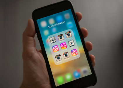
Here are a couple examples. In the early 2000s, the trend was bulging fonts. Unfortunately, this has not aged well and the AirBnB company had to redesign their logo. Another example is after Instagram unveiled its new brand identity, more and more companies started using a color gradient in their logos. When creating your logo you have the right to be inspired by new trends, however, remember to remain unique and choose timeless elements.
6- Blurry
This point is not exactly the design, but the use of your logo. Regardless of the medium, your logo must be perfect. It is important to use the correct format at all times, as this guarantees your professionalism. A blurry logo or having flaws will make you lose your credibility. For example, if you have a website, it is best to use your logo as PNG format in the header for two reasons. First, PNG files are advantageous because they allow for a transparent background. Second, these files are better quality than JPG for example.
In short, if you don't want your logo to be seen as a bad logo, it shouldn't be blurry. If needed, you can use a vector file to resize your logo without losing quality. (A SVG vector file is included in our high-resolution offering).
Reminder: The 6 criteria of a good logo
Now that we've seen the criteria for a bad logo, what are the criteria for a good logo? First of all, your logo should be memorable and easily recognizable. To achieve this, it must be unique and have an impact. Next, your logo should be versatile and simple. It must be able to be used everywhere! Be sure to have different versions of your logo as needed. For example, it is useful to have a black and white version for colored backgrounds. Finally, create a logo that is timeless and distinctive. It's good to seek trends for inspiration, but keep in mind that your logo should be able to represent your business and its values, not those of others.
In conclusion, there are many things to think about when creating a logo, but you have access to all of the tools you need to create something great. Keep it simple and build on the strengths of your business. Thus, you will be able to avoid creating a bad logo by respecting these few criteria. And if you're looking for inspiration, don't hesitate to take a look at the logo templates created by our team. You will no doubt find models that can meet your needs. Happy creation!
More tips and tricks on the blog


