Blog

New logos of 2021
We often take the time at the end of the year to analyze our good and bad moves of the last few months. So now is the perfect time to introduce the new logos of 2021! Since this year has been a bit hectic, you may not have seen the latest logo redesigns. Therefore, let us introduce you to a few companies that decided to create a new logo in 2021.
Automotive redesigns
In 2021, several automobile companies decided to take the opportunity to change their logo and brand image. Let's take a closer look at the redesigns of Peugeot, Renault, GM and Kia. In 2020, BMW, Nissan and Rolls-Royce decided to redesign their logo.
Peugeot
Peugeot is a French car brand that has always used a lion as its emblem, no matter what their logo was, and they have had several since they started in 1810! After nearly 10 years of using a combined logo consisting of a metallic-looking lion and the company name, Peugeot decided to opt for a brand-new logo this year. It is a coat of arms logo, reminiscent of high-end European brands like Lamborghini or Porsche. This logo is white and black and only the head of the lion. We think this redesign is very successful!
Renault
Peugeot is not the only French car brand that wanted a new brand image in 2021. Renault also has a new logo! Shapes have always had an important place in the composition of this company's logos. More recently, a diamond was used to represent Renault, which is perfect given its simplicity. During this redesign, this French brand went from a combined logo (a symbol and the name of the company) to an emblem logo. It's simple and respects the latest trends in logo creation.
General Motors
Now let's move on to the American side. Unlike some competitors, General Motors has not had many logos during their existence. The recommendation is to redesign your logo when there is a big change and that is exactly what GM did. This car brand can now showcase the electrification of their vehicles. They chose a trendier and more modern logo to show this change in value. There is, however, continuity with the previous logo: it is still a monogram logo with blue as the main color.
Kia
Kia had the same logo for more than 25 years. Then, in 2021, they decided to bet on a new brand image. They managed to move from a very ordinary logo to something more modern, playing with angles and symmetry to create something energetic. Also, red was abandoned for black, a so-called classic color, but also high-end. We can see here that Kia wants to show a touch of a little more luxury with this new brand image.
Sports logo redesigns
Sports teams must have a strong brand image. Therefore, it is not uncommon to see them have new logos from time to time. This year, different teams have redesigned their logo for different reasons. Let's see the new logos of the Edmonton Elks, Montreal CF, and Cleveland Guardians.
CF Montréal
Big changes for the Canadian soccer team in Montreal. This team was given a complete rebranding in 2021. The name of the team changed from the Impact to the Club de Football Montreal. Regarding the logo, it is still a badge logo, but the main symbol is now a snowflake formed by the letter M with arrows reminiscent of those of the city's metro. In our opinion, the result is interesting, however the colors used (gray, black and dark blue) are rather dull and lack contrast.
Edmonton Elks
Another Canadian team to change their visual identity: the Edmonton Elks. This Canadian football team was formerly called the Eskimos; however, the term was considered offensive to First Nations. In order to create continuity in the brand, they kept the same font and colors. The name was changed, and a new icon arrived to complete this new logo.
Cleveland Guardians
In the same vein, the American team, the Cleveland Indians, also chose to do a complete overhaul of their brand image to avoid the use of a derogatory term towards First Nations. The team was even inspired by a monument located very close to the stadium to find their new name, which is even more emblematic and representative. Once again, for the sake of continuity, the colors and font used by the team were used in this new logo.
Corporate logo redesigns
Now let's move on to some new logos of companies. As we all know, 2021 has not been a year of rest and some companies have taken advantage of the global situation to bet on a new beginning. So, let's look at the new logos of Burger King and Pfizer.
Burger King
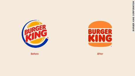
One of the most important trends regarding new logos is nostalgia. Retro is coming back in force; we are looking for moments in the past when everything seemed perhaps easier. Burger King understood that. In the last redesign of their logo, they were inspired by some of their logos from the past while simplifying their brand image. Burger King's new logo uses only two colors instead of three and is very versatile. The end result is simple, but effective.

Pfizer
One company that has certainly been very busy this year is Pfizer. Nevertheless, they found the time to create a new logo, a combined logo at that. The company kept blue as the brand's color (although they chose new hues) and a very similar font called Noto Sans. They also added an icon reminiscent of DNA. The company mentioned that they wanted a new logo as they no longer consider themselves just a pharmaceutical company.
Pringles
Simplification and retro touch. That's how we would summarize the redesign of the Pringles logo as it was directly inspired by the latest trends in logo design. Several elements of the mascot have disappeared. However, the face and mustache are still there, while the bow tie is used with the name of the product. Additionally, the name is in a new font reminiscent of Netflix. The company also took the opportunity to review the colors of the containers. In short, this redesign is tasteful and maintains the spirit of the brand.
In conclusion, there are undoubtedly many other companies that have changed their logo in 2021, and there will most likely be others that will follow in the coming months. When redesigning a logo, it is essential to keep elements that represent your values and are important for brand continuity. If you feel that your brand image is outdated or that it no longer represents you, here are some tips to successfully redesign your logo.
More tips and tricks on the blog


