Blog
The Origin of Twitter's Logo
Twitter has been around for 15 years now and is still one of the most used social media platforms in the world. We all know what this little blue bird looks like and we all recognize its little whistle when you receive a notification. But do you know where the inspiration for Twitter's original logo or name comes from? Today, let's take a closer look at the origin and history of the Twitter brand.
A few words about Twitter's history and when it was founded
When was Twitter created and what was the original symbol?
The history of Twitter began in 2005 in San Francisco. When it was created, by Jack Dorsey, Evan Williams, Biz Stone and Noah Glass, Twitter did not at all have the same brand and logo design as we know today.
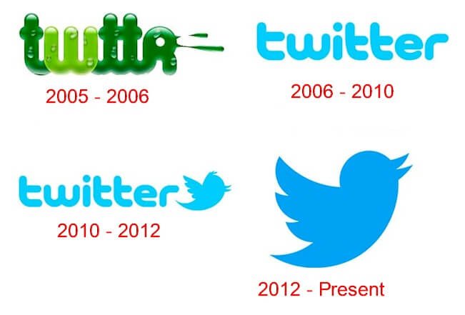
Before introducing you to the different logos of this social media platform, let's go back to the meaning of the word "Twitter". One evening, Jack Dorsey and Noah Glass had the idea for a platform where people could publish a status and have a conversation. Glass later looked for a name in the dictionary and came across "Twitter" meaning chirping, or agitation. Then, Biz Stone prepared the first designs for Twitter, or Twttr as it was called at the time, opting for a signature logo. And yes, they decided to remove the vowels from the original word for a few logo designs. Finally, only the green "twttr" logo with small water drops would be the first emblem of the company.
On March 21, 2006, the first tweet by Jack Dorsey was published. Just a few months later, the company was counting on a redesign of its brand image and Twttr brought the vowels back thanks to Linda Gavin, a designer working for the agency Furture farmers. In 3 days, a new website and a new logo were ready.
The Twitter logo redesign was light blue on a white background, with smooth outlines. However, not all users appreciated this change. Some found it too childish. But, that's what Glass chose.
Where does Twitter's blue bird come from?
This is not the only change that occurred in 2006. Yes, the other change was the arrival of the blue bird, the famous symbol of the platform.
This bird was bought for $15 on iStock and was created by Simon Oxley, who at the time only received $6 because of commissions.
Why did Twitter choose a blue bird as their symbol?
To continue with the idea of the name of the platform, which refers to the song of certain birds.
To get a message across. Tweets are sent – fly away – and are transmitted as fast as a flying bird.
For the symbolism: a bird means freedom or success. According to color meanings, blue is also one of the most popular and accessible colors.
This first bird would not be used as the official Twitter logo, as it was not legally allowed by iStock. So, it was put in the header of the site.
Fun fact: This bird was named Larry, in honor of Boston Celtics basketball player Larry Joe Bird, an NBA legend.
Between two brand image changes, we saw the arrival of a new addition to our everyday language. We are talking about the use of hashtags in August 2007, which were a great success given that most platforms adopted the concept.
The Twitter logo evolution over the years
Why was the Twitter logo changed?
As the platform grew, Twitter executives were disappointed that they could not use the bird as a logo. So, it was time to say goodbye to the bird from iStock and hello to the designers who would help Biz Stone create the bird that is close to the current logo. Two versions of the bird were created by Biz Stone and Philip Pascuzzo, one in cartoon version and the other more minimalist.
The official Twitter logo in 2010 was introduced by designers Philip Pascuzzo and Douglas Bowman. This version was a combined logo, bringing together both the name "Twitter" introduced in 2006 and the minimalist bird, which was chosen to avoid having unnecessary elements. It is said that this Twitter logo respected the rules of proportions and the golden ratio. It is one of the reasons why it worked well.
Then, in 2012, Twitter made their last change. The combined logo would become a symbol logo. The founders assumed that the social network was known well enough to no longer need its name. In these years the company was worth several million dollars and had more than 200 million active users. This Twitter logo could therefore stand on its own two feet.
Twitter's last logo
Finally, what has changed since the 2010 design? As we have seen in different articles on the history of logos of major brands, the original design was simplified.
A feather from the wing and the tough of feathers from the head were removed. The bird had a silhouette resembling that of a hummingbird with the beak being more accentuated upwards. Have you noticed how perfect every line and every curve look? There is a reason for that. The bird was, in fact, drawn thanks to the superposition of 15 circles. According to Doug Bowman, who had worked on the previous version of the bird, the circles represent "your networks, interests and ideas that intersect with your friends and peers."
Update: The arrival of Musk and X
Who now owns Twitter? What is the new official logo?
As you may already know, Twitter was bought by billionaire Elon Musk. Unfortunately for the blue bird, Musk decided to do a complete rebrand of the social media to separate it from its past owner. Twitter's name changed to X, and the logo is now a simple white X on a black background. Time will tell if this new logotype will prevail, but we think we will miss the bird emblem. Nonetheless, it is not uncommon to see business change their logo drastically when a big change occurs.
How to get inspired by Twitter when creating your logo
Even though the name of the platform was found in a dictionary, that didn't stop Twitter's founders from keeping it and associating their brand image with it. First, try to stick to your initial idea then develop and enhance it. That way, you will get the most out of it. For example, by sticking with your initial idea and developing it, you will be able to create a meaning, a drawing, etc. Once this idea is in place and depending on what type of logo you want, keep it simple. Twitter's font has few elements, and the creators chose the color blue, because it represents reassurance and stability. Have you ever noticed that blue is a color widely used by social media platforms, but also by businesses in general?
Following this, Twitter wanted to incorporate a drawing, an image to represent the company. They were inspired by the name they chose and obviously chose a bird as her emblem, given that this is the very definition of Twitter. They used this base to simplify it as much as possible, because lots of details are not necessary to impress. As well, people rarely remember the details of a logo. So, if you decide to add an image to your logo, try to find a link with your business name, while keeping it simple. And of course, like Twitter did, you can match colors or add contrast.
In conclusion, it is the end of a chapter. Twitter will never be the same again with the arrival of Elon Musk and X; however, many of us will remember the blue bird emblem and the limitless possibilities and ideas we once found on this platform.
More tips and tricks on the blog
