Blog

How to Create a Logo for a Mobile App
When creating your business, you must keep in mind that you will have to use your logo everywhere, whether on your website, a sweater, or your business cards. If you want to have a mobile app, you will have to have a strong symbol that will be easily recognized. In this article, you are going to find out how to create a logo for a mobile app.
The dimensions of mobile applications
Before you start anything, it's important to mention the dimensions requested for mobile apps. This is because Android devices do not use the same dimensions as iOS (Apple) products. According to the 99Designs website, the recommended dimensions of a mobile application logo are 864 x 864 pixels, for a square shape. The icon will then appear in 96 x 96, 72 x72, 48 x 48 or 36 x 36 pixels depending on the type of device.
For Apple products, the requested dimensions are 1024 x 1024. Everything will then be resized according to the type of device. It should be noted that in both cases, the image format to use is PNG.
What to keep in mind when creating a logo for a mobile app
Now that you have an idea of the necessary dimensions, let's move on to the creation stage. We have five important things for you to keep in mind when creating a logo for a mobile app. There are some specificities regarding application icons that should not be forgotten.
Use your branding
It doesn't matter if it's a logo for a mobile application or a website Favicon, you need to use the components of your brand image. A brand image is much more than just a logo. It's the color palette, fonts, type of icons, and style of your brand. For us to easily recognize an application that is related to your company, it is necessary to keep a certain consistency. So that's why it's critical to reuse the different components of your brand when creating a logo for your mobile app.
Choose attention-grabbing colors
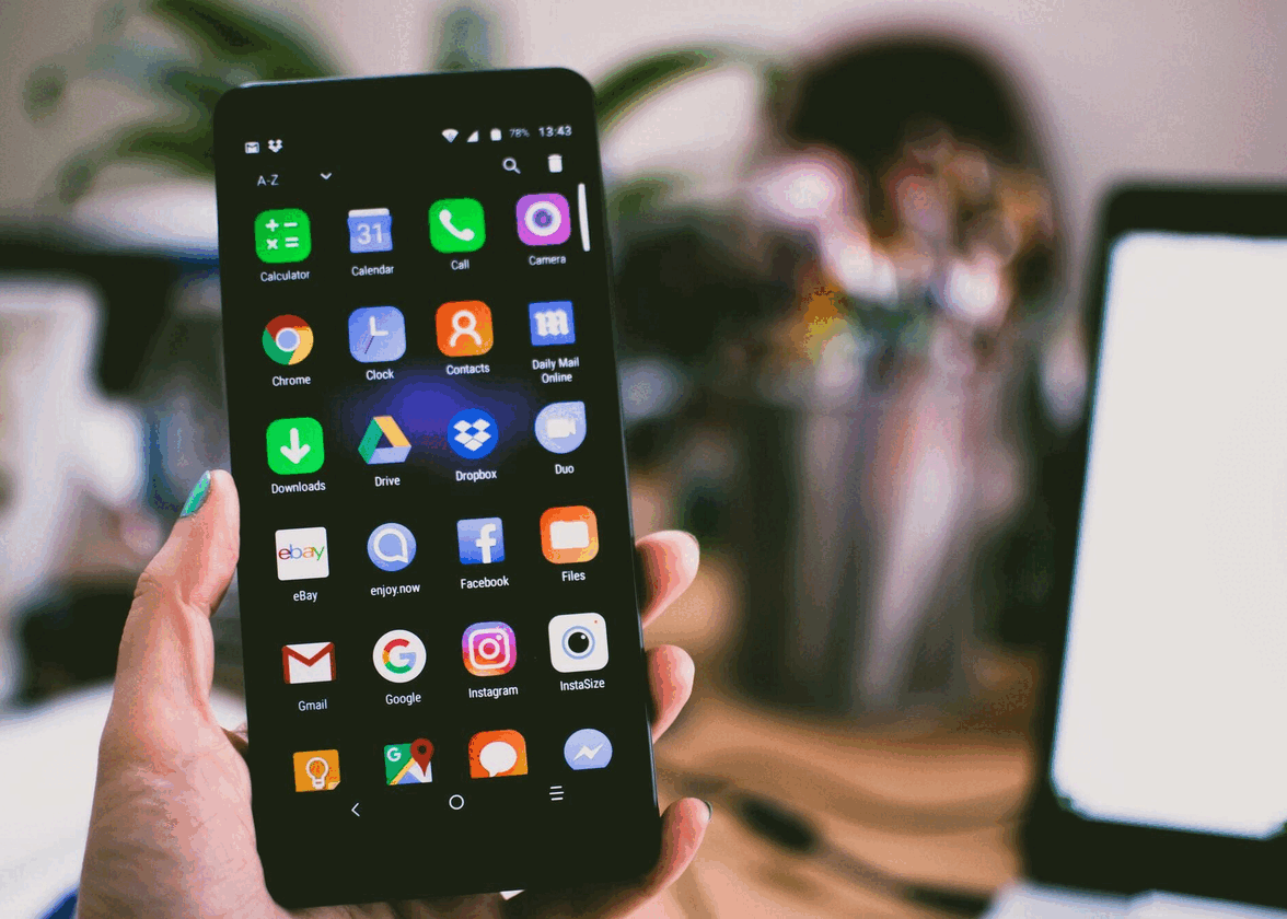
Grab your phone and take a look at all the mobile apps on it. You will most likely find more than a dozen. Since people tend to have multiple mobile apps on their devices, it's important that yours be easy to find. One way to do this is to use attention-grabbing colors. You don't have to use a bright red to achieve this result, you can do this with contrast. However, do not forget to opt for the colors of your brand and do not use more than three different shades to keep a balanced effect.
Specify what your mobile app is for
As well, it might be nice to indicate what your mobile app is for or at least give a hint. As we just mentioned, more and more people are using different mobile apps and it is relevant to remind them of what yours does when they see your logo. Here's an example. The company Google offers several different apps, and each has its own emblem. The app logo for Gmail looks like a letter, while Google Maps uses a pin.
Think about the shape
An important point regarding creating a logo for a mobile app is the shape. In fact, the shape used by the applications is currently a square with rounded corners. This is most certainly something to keep in mind during the creation process. Make sure that the most important components are well centered. Obviously, it would be a good idea to create a logo that can easily fit into a square or circle, as is the case with most social media. If your company logo is more rectangular in shape, you may want to use only certain parts of your logo for your mobile app version.
Keep it simple
Finally, here is the most important point to succeed in creating a logo for your mobile application: keep it simple! If you take a look at the mobile applications present on your phone, you will understand very quickly that simplicity is required. First, since the icons are small, you cannot afford to add details or too many components.
Here are some tips for creating a simple logo for your mobile app. First, if you have created a combined logo for your company logo, why not use just the icon? This is what several companies like Tripadvisor or Airbnb have done. If you have a signature logo instead or your company name as the most important component, you could opt to keep only the first or a few letters of the company name. That's what Facebook and Netflix did.
In conclusion, if you're working on a mobile app, take a moment to create a logo that's both fantastic and effective. Keep it simple, use the components of your brand, stand out from other apps, and keep the square shape in mind. Over time, you may have to have different versions of your logo in order to meet all your needs. Remember that your logo should look good, no matter the medium. Good luck!
More tips and tricks on the blog


