Blog

The Most Iconic Logos
The invention of logos dates back to ancient times when artisans would mark their creations with unique symbols. However, in the 20th century, the logo concept moved from artistic creations to iconic brands.
Building iconic logos is essential because they serve as a visual representation of a company's values, mission, and personality while ensuring that the brand has a lasting impression. They provide a way for customers to identify and connect with a brand, even if they need help remembering the company's name. A strong logo can convey trust, professionalism, and credibility, while a poorly designed one can have the opposite effect. As companies began to expand and compete, they needed a way to differentiate themselves from their competitors. A well-designed logo became a crucial tool for building brand recognition and establishing a company's identity.
Creating a logo for marketing and advertising requires its design to be fluid. The logo represents the brand or a business on all its collaterals, such as business cards, billboards, social media, and websites. A well-designed logo can create a sense of professionalism and legitimacy, while a poorly designed one can make a company look unprofessional and untrustworthy. As competition continues to increase, the importance of a well-designed logo will only continue to grow.
So, when we talk about iconic logos, which one pops into your head?
Mastercard
The Mastercard logo is a prime example of the importance of logo design for advertising and marketing. Its simple yet striking design has become instantly recognizable worldwide, helping to establish the company's identity and build brand recognition. The logo's unique design has also been used effectively in various advertising campaigns, reinforcing the company's values and mission while creating a sense of trust and professionalism. The Mastercard logo features two overlapping circles, one red, and one yellow, with the company's name in lowercase letters. The circles represent the merging of customers and merchants, while the red and yellow colors symbolize passion and joy. The logo's simplicity and colors have helped make it one of the most recognizable logos in the world.
Apple
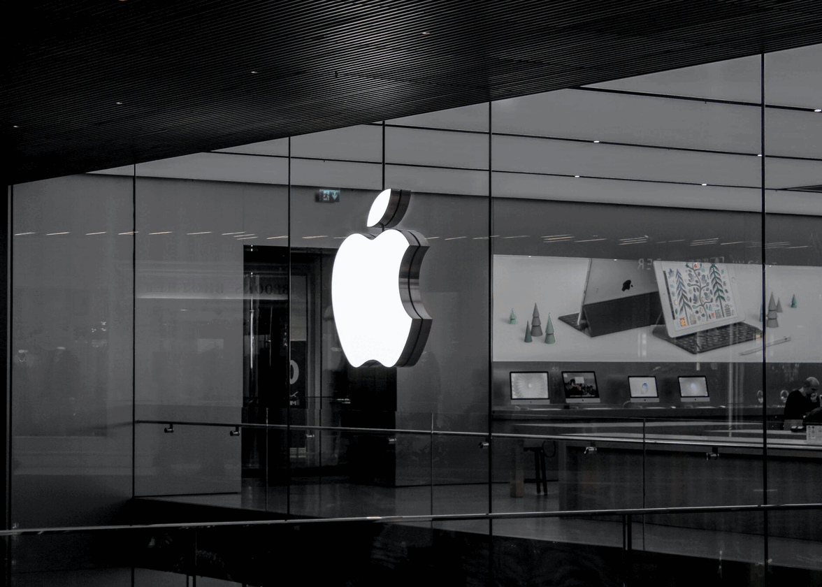
The Apple logo is a simple yet iconic design that features an apple with a bite taken out of it. It started with an image of Isaac Newton under an apple tree and has since become an apple with a bite taken out. The logo represents the evolution of the company's brand identity and its journey from a struggling company to a powerful global brand that constantly innovates new products. The logo has undergone several iterations, but it's clean lines and minimalist style have remained consistent. The logo has become synonymous with Apple's innovative and user-friendly products.
McDonald’s
The iconic McDonald's logo, featuring the golden arches, was inspired by the architectural arches flanking each restaurant and was incorporated into a new corporate logo in 1961. The logo has undergone several transformations, but the golden arches have remained constant since 1968. The logo's design elements include its simplicity and the subtle message of two golden brown French fries bent into the shape of an M. Yellow represents happiness and visibility. At the same time, red stimulates activity and increases heart rate, jumpstarting appetite. The logo is considered one of the greatest logos ever created and is synonymous with pop culture and the success of McDonald's as a global fast-food chain.
The Google logo has a fascinating history dating to the company's inception in 1995 as BackRub. The logo has undergone numerous transformations, with the current version featuring a playful and colorful design with a unique typeface. The bright primary colors were chosen to convey the innovative and cutting-edge nature of the company. The colors were chosen carefully to represent the company's vision, and the design has remained consistent for over two decades despite some changes. The logo's simplicity and recognizable design have helped make Google one of the world's most valuable and recognizable brands. What also makes Google an iconic logo is its fluidity under every remembrance day’s adaptations.
What goes into the making of an iconic logo?
Creating an iconic logo is a process that involves several key steps. It involves stages such as research, understanding the brand's positioning in the market, and then representing these features and value in a visual design format. But it’s not as simple as it sounds.
The foremost step in developing an iconic design is to research and understand a brand's values and mission for a good logo, study the company's history, products or services, target audience, and competition. This helps ensure the logo accurately reflects the brand's identity and resonates with its customers.
Then comes the stage of analyzing the target audience, considering factors such as age, gender, education, income, lifestyle, and interests. This helps to ensure that the logo resonates with the intended audience and effectively communicates the brand's message. Additionally, researching the competition can help identify design trends that appeal to the target audience and ensure that the logo stands out in the market.
The stage of designing also requires a level of research. The research is to understand colors that evoke certain emotions in the target audience. For example, a red color in a logo is considered to be a happy one that incites hunger, whereas blue stands at the forefront of technology. When it comes to typography, the formula is a simple one. The more artistic the brand or business offering, the more complex the typography will be. Yet, experts in the industry often recommend simpler typography that allows the target audiences to read the brand messaging well.
Remember, the most iconic logos are made from the heart. A color and design that appeals to you, your business, and the people it serves. While hiring a logo artist is the best way to initiate the process of building an ever-evolving iconic logo, there are also tools available on FreeLogoDesign that allow you to take the first step in understanding the process yourself. The key to building a successful logo is to ensure that it communicates and reads well. Good luck making the next big logo the world will talk about.
More tips and tricks on the blog


