Blog

What Are the Best Fonts for a Logo?
It's not just colors that can give your logo personality. In fact, fonts can help you show your values and give a precise look to your brand image. But what are the best fonts for logos? What should you keep in mind when creating your logo so that it is a success?
What are the fonts used for on a logo?
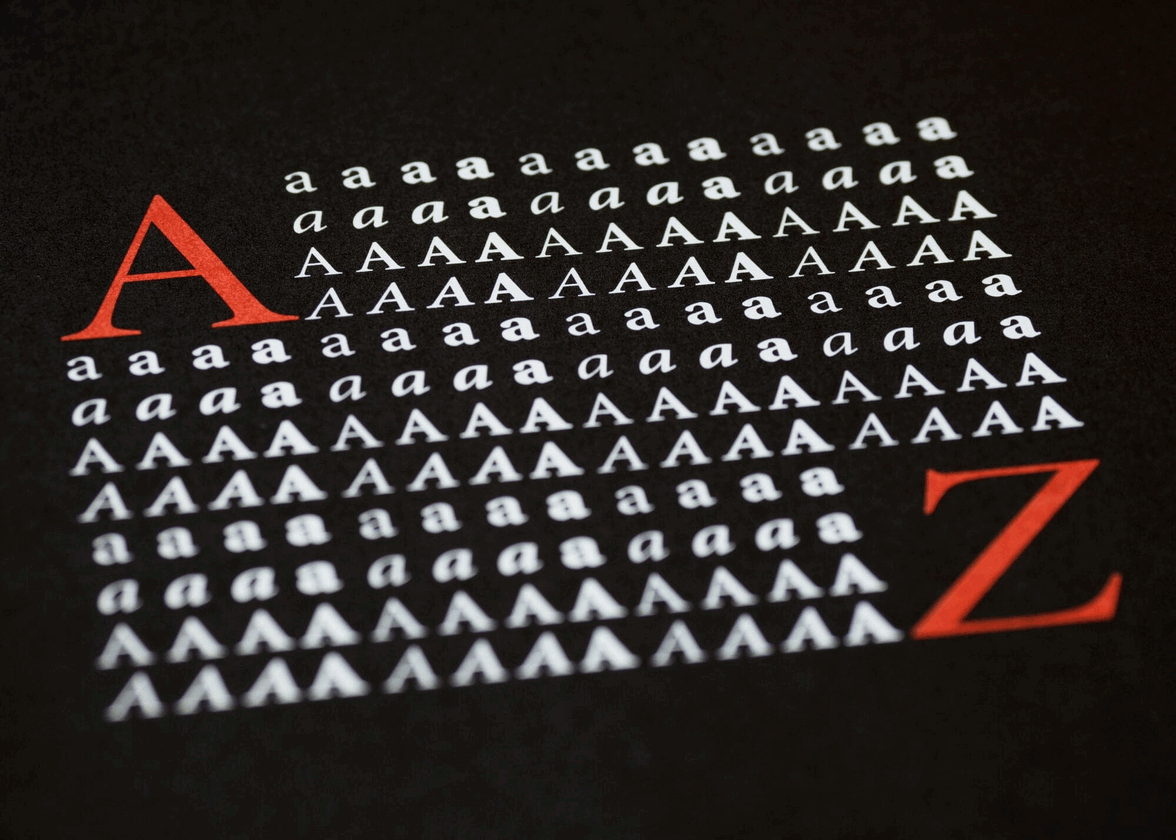
Before we begin, let's take a moment to talk about the roles of fonts. According to their definition, a font is a complete set of typefaces in the same family. In other words, a font is a way of using letters with a precise aesthetic.
Fonts are used in logos with letters or numbers. For example, the name of a company. This is one of the components of your branding. That means, fonts are chosen to give a look to your logo, just like the type of icon or colors. Would Google have the same modern look if it had chosen a different font? Would Ford have been able to stand out from the competition by opting for a serious font? Fonts can help you show who you are at a glance.
What to keep in mind when you're looking for the perfect font
If you want to create a signature logo or a combined logo, you will need to find a font. Since there are hundreds of different fonts, here are a few things to keep in mind when searching. Do not hesitate to try several to find the one that best suits your needs and the idea you have for your logo.
An easy-to-read font
If you decide to use text in your logo, it's most likely because you want people to be able to read it. Therefore, the font you choose should be easy to read, at least be legible. It's true that some more extravagant or decorative fonts can help you stand out. But, if people can't read the text quickly, it's a waste of time. Also, check if the text is readable even when the size is small. This will help you have a flexible logo that can be used anywhere.
A font that represents you well
Then, we must not forget that as mentioned above, fonts are a part of your branding. They must therefore represent your company or its products. There are several types of fonts to help you show your values. For example, serif fonts are often used for traditional, luxurious, or serious sectors. On the contrary, sans serif fonts are considered by many to be modern and accessible. It's up to you to see what's best for your logo.
A font that is not too neutral
One mistake we frequently see is a simple or neutral font. It can be tempting to choose a plain font or one without character if your target audience is large. However, since every component in your logo is an opportunity to show your personality, it would be a missed opportunity if the font was plain. It is not necessary to choose a font with a lot of character, often a few small details can make a big difference. Again, we recommend trying out multiple fonts when creating your logo.
A font that is not used very much
In the same vein, some people may be tempted to choose a font that is already used by large companies. We do not recommend it. Just because you decide to use Netflix or Coca-Cola's font doesn't mean you'll gain some of their prestige. On the contrary, some might see it as an attempt at copying. Therefore, when you are looking for the perfect font, consider using a font that is not already overused.
Some great-looking font suggestions for your logo
To help you with your research, FreeLogoDesign has found some great-looking fonts that you could try when it's time to create your logo. It is important to mention that there are more than 200 different fonts in our logo maker. So, there is definitely one that will meet your needs.
For a professional look
If you want to give your logo a professional look, we recommend using fonts like: Cinzel, Judson and Bitter
For a feminine look
If you prefer to emphasize softness and femininity, we recommend these fonts for your logo: La Belle Aurore, Croissant One, Pacifico
For a modern look
If you are a company working in the field of technology or want to show that you are a part of the latest trends, here are our font suggestions for a modern look: Arsenal, Fjalla One, and Spartan
For a strong look
If you work in a very competitive field and you want to stand out by showing your strength and sturdiness, find fonts that could meet your needs: Bangers, Bungee and Monoton
For a playful look
If you don't want your logo to look too serious or work in a more playful field, here's what we can offer: Baloo Bhai, Cherry Swash and Englebert
In conclusion, we know that it can be a challenge to find the perfect font. However, remember that by choosing carefully, you will have a better logo. So, what are the best fonts for logos? In our opinion, a font that is easy to read, representative and not overused. If you want to know more about current trends for logos, do not hesitate to check out our article on the trends of 2023. Enjoy creating!
More tips and tricks on the blog


