Blog

The Meaning of the Logos for the 2024 Paris Olympics
2024 is a leap year and that means if all goes well, we're going to have another Summer Olympics! After Rio and Tokyo, Paris will now host this major global event. And every host city must have an official logo for both its bid and the Games. Some Olympics emblems have been great successes, while some designs have fallen short. So, let's take a closer look at the look and meaning of the 2024 Paris Olympics logo.
Why are the next Summer Olympic Games going to be held in Paris?
Before we get started, we thought it was important to look at the location of the next Olympic and Paralympics Games since this has a direct impact on the logos and visual identity created and used. In 2024, the Summer Olympics will be held in Paris. As you may know, this isn't the first time the French capital has been awarded this honor. In fact, this is its third time. The Olympics have a special significance this year, because it marks the 100th anniversary of the 1924 Paris Olympics.
The Paris 2024 Olympic Games logo
Because we love logos, we've taken the time to analyze the emblems of the upcoming Olympic Games. It's worth noting that more than one logo is often required. Hundreds of designers and agencies try to come up with the perfect idea since this symbol is seen by thousands of people. It must also represent the host country, which in this case is the people of France.
There are many reasons why we like the main logo for the Paris Olympics. It's certainly a better design than the one for the London Olympics a few years ago. What's also interesting is that each component of the logo is explained and very representative. Let us take you through it all. And no, it is not because it is using a flame that it is necessarily identical to the Tinder logo.
The application logo to become the host city
There's a long process involved in becoming the host city for the Olympic Games. As this is a once-in-a-lifetime event, the Olympic Committee must ensure that cities have the resources they need to welcome thousands of athletes and visitors.
When a city wishes to submit a bid, it creates a logo for the purpose. Often, the bid logo does not resemble the one that is used for the Olympic Games.
As far as the Paris bid logo is concerned, it's simple, well executed, and representative. At first glance, it consists of colorful lines, but on closer inspection, two important components stand out: the Eiffel Tower and the numbers 2 and 4. We don't need to remind you that the Eiffel Tower is located in Paris. But why the numbers 2 and 4? Quite simply, it's a nod to the 2024 Games. Also, the logo has different color gradients of the colors of the Olympic Games logo and the name of the candidate city. For the candidate city name, Paris is capitalized in black, in a sans-serif font.
The official symbol of the 2024 Olympic Games
What is the meaning of the Paris 2024 Olympics logo?
Now let's get down to business: the official logo for the 2024 Olympic Games. At first glance, it might seem simplistic, but they've managed to incorporate several components related to the games and the host city.
Let's start with the components in question. The image of a flame is in a golden circle, using simple graphic shapes. Within the flame are feminine lips. So, what are the inspirations behind this logo? First, two important symbols are used to represent the Olympic Games: the Olympic flame and the gold medal. It's also worth mentioning that gold is the main color of the entire brand surrounding the Paris Olympics, once again a reference to the event, but also to excellence.
On another note, it's important to point out that a typography has been created especially for these Olympic Games. Named Paris 2024, it is directly inspired by the Art Deco style. As well as being another nod to the previous 1924 games, this gives an elegant, original and very French effect. It's also worth mentioning that Art Deco was one of the major logo design trends of 2023. Various versions of this font were also created, with thinner or thicker letters to suit all needs.
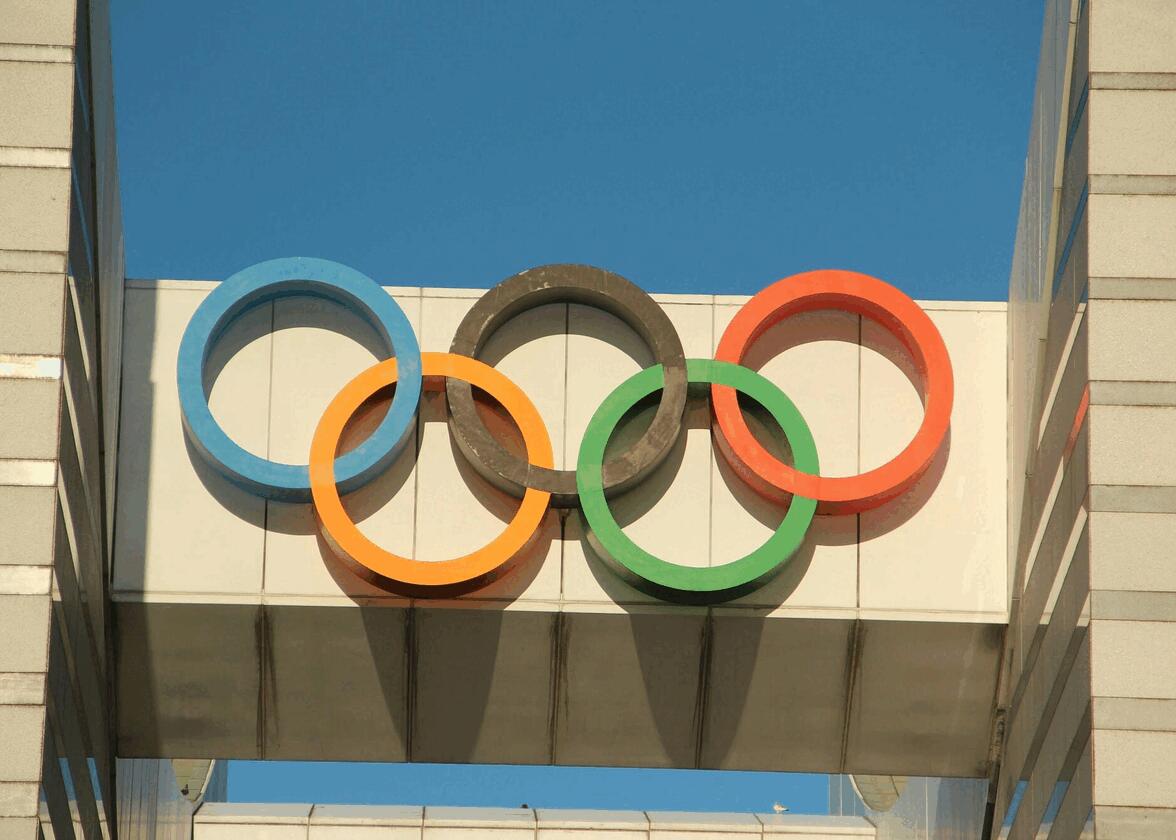
Finally, under the words Paris 2024 is the official symbol of the Olympic Games. All Olympic Games logos must include this logo.
Who is the woman in the Paris 2024 logo?
But what about the lips? How does it represent Paris or France? To find the answer to this question, we need to study important French allegorical figures, especially those of the Republic. This component represents Marianne, a strong symbol of the French Republic and its motto: Liberté, Égalité et Fraternité. She is often seen wearing a bonnet and is featured in many French sculptures and paintings. The presence of Marianne in the Paris Games logo is simply a nod to French history.
The official logo of the 2024 Paralympic Games
Usually, the host city creates two different logos for its different games, one for the Olympic Games and one for the Paralympic Games. However, this is not the case for the Paris 2024 Olympic Games. In fact, the organization preferred to use the same logo for both events, a first. To explain this, it has been said that the two events are like two sides of the same coin, and therefore of the same symbol, making everything more accessible.
Then, as with the Olympic version, the Paralympic logo is below the symbol.
In conclusion, is the Paris Olympic and Paralympic Games logo a success? We think so. It's not revolutionary, but it is representative and flexible, two important characteristics of a good logo. It also has a classy look and a unique energy. So, if you're looking to create a logo, remember to keep it simple and use elements that relate to your region. Enjoy the games!
Do you know the meaning and story of the official Olympic logo? It has been used for more than 100 years and was created by the founder of the Games himself: Pierre de Coubertin.
More tips and tricks on the blog


