Blog

The Meaning of the Rolls-Royce Logo and Its Evolution Over the Years
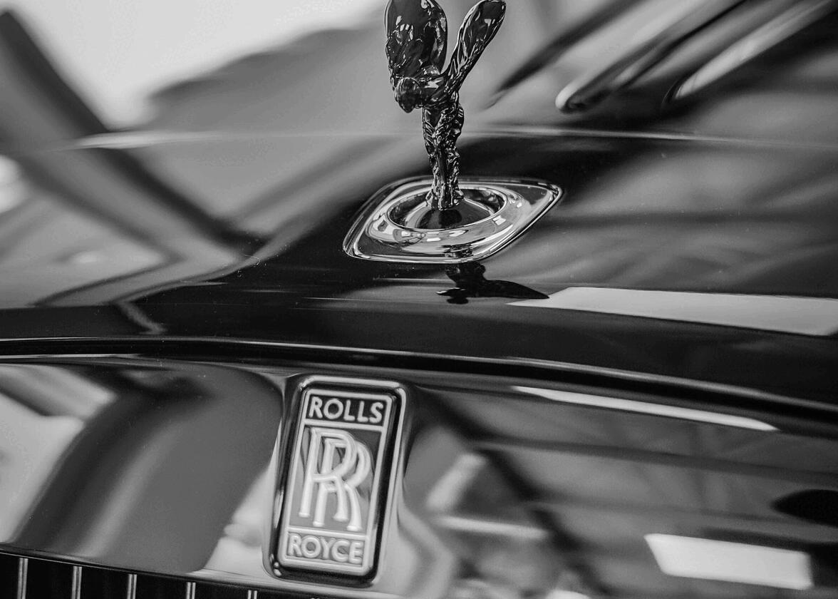
Over the past few years, we've written articles about several luxury brands and car manufacturers. BMW, Mercedes-Benz, Ferrari and Porsche are car brands that make more than someone dream. Today, let us add another legendary company to that list: Rolls-Royce. Let's take a closer look at the meaning and evolution of the Rolls-Royce logo over the years.
A few words about founding the Rolls-Royce company
Before we jump right into the logo, let's learn more about founding Rolls-Royce and their founders. These are aspects that will be reused later by the brand.
Rolls-Royce is an English company that was founded in 1906 by Henry Royce and Charles Rolls. Initially, they specialized in manufacturing luxury automobiles. But soon after, they also ventured into aircraft engines, which would be essential during the world conflicts in the years that followed. Henry Royce was the one who came up with the founding principles of Rolls-Royce that is still the basis of the brand today: ''Seek perfection in everything. Take the best of what exists and make it better.'' And when nothing exists, design it. The vehicles would stand out for their quality, but also for the presence of their famous radiator cap and their imposing grilles.
In the 1930s, Rolls-Royce bought Bentley, another British car manufacturer. Then, in 1980, a military equipment company bought the company. Finally, BMW got its hands on Rolls-Royce in 1998.
Rolls-Royce's first logo
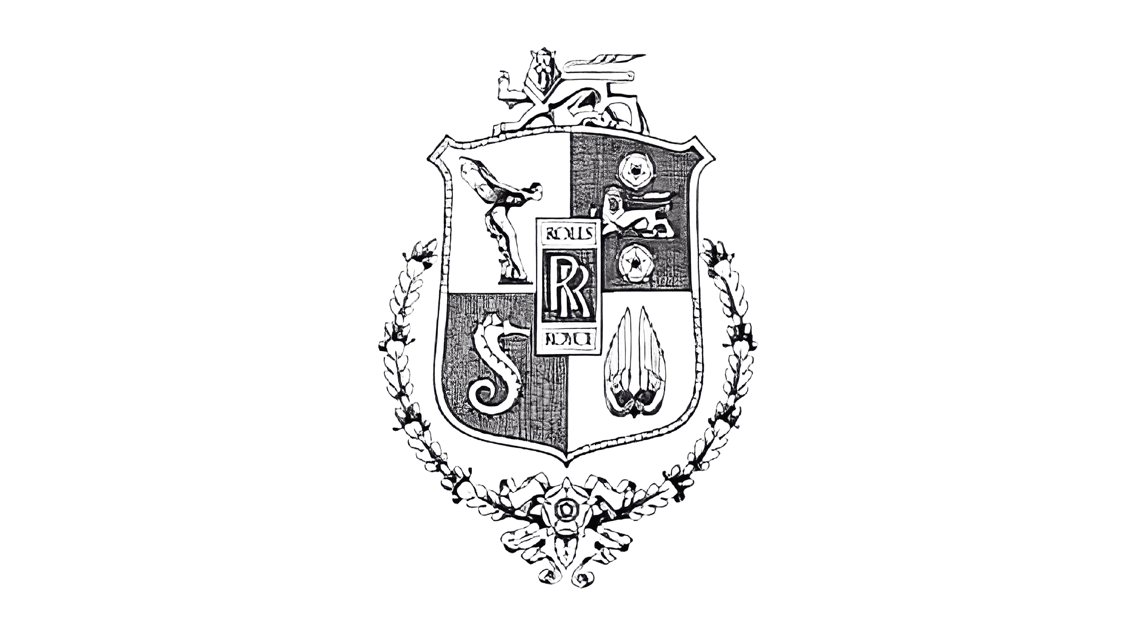
Rolls-Royce's first logo, used as early as 1906, was as complex as Cadillac's first logo. We have to say that at that time it was common to use coats of arms to represent luxury brands.

The centre of the logo would become the basis of the Rolls-Royce brand, the monogram of the two R's were to pay tribute to the names of the two founders. Then, four different symbols were used in the badge. At the top left was the Spirit of Ecstasy which is the famous radiator cap. It was the silhouette of an elegant woman, a representation of the goddess Nike. At the top right are a lion and two roses. The lion symbolizes England, while the two roses come from the coat of arms of the city of Manchester, the city where Rolls-Royce was founded. On the lower left, a seahorse was used to illustrate strength and reliability. Finally, at the bottom right, two wings were added to once again represent Nike, the Greek goddess of victory.
Unfortunately, or fortunately, depending on the case, this first logo was only used for a few years.
The evolution of the Rolls-Royce brand over time
Rolls-Royce has had several logos throughout its history. As early as 1911, the English brand opted for a slightly simpler logo. They kept the badge with the monogram of the two R's and the name of the company and added two lions standing on each side, wings on top, a rose at the bottom, then the slogan: The best car in the world. Their messaging here was definitely clear. A simplified version would also be created to meet different needs. This version included only the letters R and R in an oval decorated as a coat of arms.

Finally, in 1973 the brand modernized by opting for a much simpler logo. This time, they kept the two Rs, but gave them a light 3D look by using a combination of gray and white to create a shadow. The background is a dark blue, rectangular shape.
In 1998, Rolls-Royce decided to go back to their roots with a new logo. This coincided with BMW's takeover of the company. The redesign was simple: they opted for the center of the original logo in a rectangular, gray badge. Both Rs were in the same serif font, while a sans-serif font was chosen for the brand name. They even gave a slight 3D effect, which was fashionable in the 2000s among car manufacturers.
As you've probably noticed, in recent years, many brands and businesses have chosen to simplify their logos. Rolls-Royce is no exception. In 2020, the English manufacturer decided to keep only the monogram side of its logo in order to be able to use its logo more easily everywhere, for example on its website. However, it is important to mention that the badge version with the brand name could also be used if needed.
How to get inspiration from Rolls-Royce when creating your logo
If you're looking for inspiration to create your logo, Rolls-Royce can certainly give you some ideas. First of all, the founders relied on their names to find their brand name, but also the heart of their visual identity. This is something to consider if you're looking for a perfect name for your business. Then, over the years, they were inspired by components related to their homeland or city of origin to decorate their emblem.
On another note, why not opt for a type of logo that is rarely used such as a monogram logo? Several luxury brands such as Louis Vuitton, Givenchy or Chanel have chosen this option to stand out. If you're targeting a high-end clientele, this might be a good idea.
In conclusion, in addition to being a luxury brand, Rolls-Royce is a car manufacturer that has successfully renewed its brand image over the years. Starting with a coat of arms logo, they have been able to keep a strong common thread through the redesigns. Who says a luxury brand logo has to be complicated? On the contrary, simplicity and minimalism are often better options.
Would you like to know more about the history of other prestigious car manufacturers? Learn about the origin and evolution of the Porsche logo, another emblem with several important symbolic components.
More tips and tricks on the blog


