Blog

The history and meaning of the Lamborghini logo
Some of our most popular blog posts include many posts about the history and evolution of well-known company logos, especially those of luxury brands. In addition to often being sources of inspiration, it is interesting to know the hidden meaning and origin of these emblems. This article is no exception: let's take a closer look at the history and meaning of the famous Lamborghini logo.
A few words about the Lamborghini company and its history
So far, we've gone over the logos of several European manufacturers, including Alfa Romeo, Ferrari, Porsche, BMW, and Mercedes-Benz. How is Lamborghini different?
Unlike many companies in the automotive industry that were created at the beginning of the 20th century, Lamborghini is rather recent. Although Ferrucio Lamborghini decided to start building tractors in 1948, it was in 1963 that he decided to build luxury vehicles. It was precisely his success in building tractors after the Second World War that gave him the necessary funding for this project.
Ferrucio Lamborgnini was a great admirer of sports vehicles, owning Ferraris himself. Unfortunately, it is said that he was never completely satisfied. It would even be during a meeting with Enzo Ferrari that the founder decided to launch his own cars, and the factory was located in the Bologna region of Italy.
In the following years, Lamborghini would introduce many models such as the Miura, Islero, Espada, Countach, Gallardo and Diablo. However, the Italian manufacturer experienced financial difficulties and was acquired by Chrysler in 1987, then Audi in 1998.
The first Lamborghini logo: why a bull?
If we exclude Ferrucio Lamborghini's first company specializing in the manufacture of tractors, the emblem of this Italian brand has always included a bull. We have to tell you that this is a good way to stand out when you think of Ferrari and Porsche who used horses. But what exactly is the meaning of the bull?
First, the meaning is related to two aspects of the founder. First, Ferrucio Lamborghini's star sign is Taurus. Second, the Italian was very inspired by the world of Spanish bullfighting and the power and combativeness of these animals. Many of the names of his luxury cars come from the world of bullfighting.
Regarding the first emblem as such, it is a badge logo in the shape of a shield. The predominant color was red, in reference to the Bologna area where the company was founded, and the bull is shown charging. The word Lamborghini is placed under the coat of arms, in a cursive font. This version was used from 1963 to 1972.
.png)
The evolution of the Lamborghini brand over time
If you're familiar with car brands, you probably know that Lamborghini's logo isn't red, but black and gold. In 1972, the company redesigned its logo and drastically changed the color palette. The shape of the shield was kept, but the bull was coloured gold on a black background. Also, the brand name was added inside the emblem, in capital letters, in a sans-serif font. A black and white version was used from 1974 to 1998, the years when the Italian company experienced financial difficulties.
Finally, in 1998, Lamborghini regained recognition. They were inspired by the 1972 logo while modernizing it and adding a slight 3D effect. The bull symbol was reworked, and the final result was much more refined than the previous version.
.png)
A new overhaul in 2024
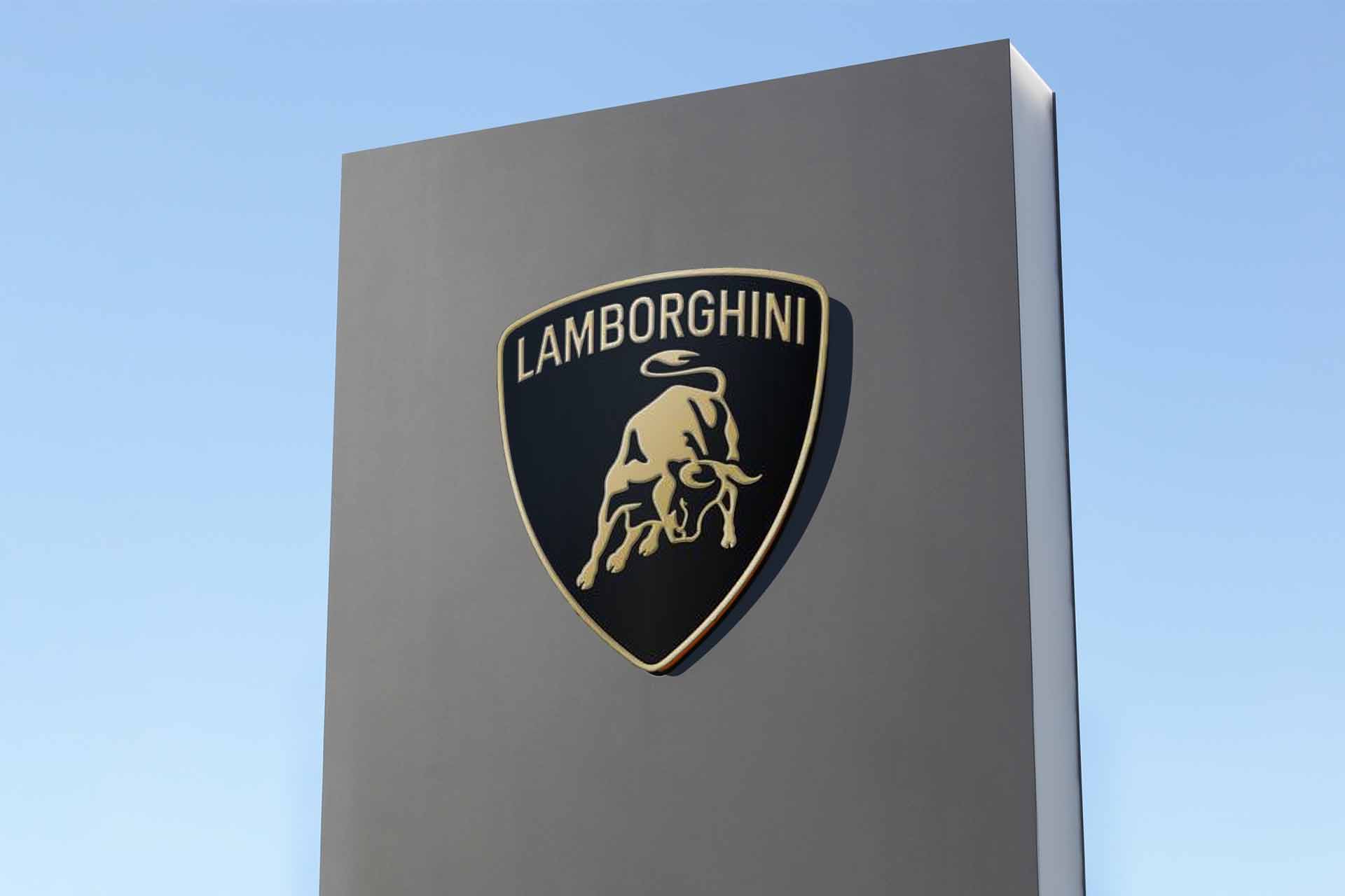
Surprise! A few months ago, Lamborghini introduced a new version of their logo. As we have seen with many companies that have recently changed their logos, many are focusing on simplifying their brand image. This is the case here for Lamborghini. All the important components are present, but several details have been removed.
For example, the exterior gilding is now thinner, and several details of the bull were removed. The gold was also replaced by a duller, more beige shade. A very slight gradient of white is also present, probably to give a light effect to the symbol. The brand name remains one of the important visual components, being placed at the very top.

What font is used on the current Lamborghini logo?
If you're interested in the world of typography, you may be wondering what font is used on the Lamborghini logo. Truth be told, this is a sans serif font created by the company.
However, if you want to use a handwritten font reminiscent of the retro and elegant side of the brand, many recommend La Macchina.
In FreeLogoDesign, we suggest these fonts if you want to reproduce the look of Lamborghini: Fjalla One, Lato and Molengo for the current company name and Dynalight, Grand Hotel, Lily Script One for the more retro look.
How to get inspired by Lamborghini when creating your logo
Now, if you're looking for ideas for your logo, here's how to get inspired by Lamborghini. To start, unlike other competitors like Porsche and Ferrari, Ferrucio Lamborghini bet on a completely different animal to stand out. In addition to having a certain meaning for the founder, he was inspired by the world of bullfighting to create a whole universe.
Then there is the question of colors. From the very beginning, Lamborghini wanted to show that they were able to create vehicles as luxurious as Ferrari. This can be seen in the shades chosen. Gold is a color associated with wealth, while black is often used to represent elegance.
In conclusion, it is amusing to see how Alfa Romeo pushed Enzo Ferrari to create his own car brand and that history repeated itself with Lamborghini. The logo of this Italian manufacturer remains a good example of an emblem that has both stood out and shown its values.
Would you like to learn more about logos of other Italian brands? Discover the history, but above all the meaning of the Alfa Romeo logo. And yes, their symbol does indeed include a child-devouring monster.
More tips and tricks on the blog


