Blog

Create a Shield Logo: Some Tips and Examples
You probably already know that each visual component used on a logo can have very specific meaning. Whether it's the choice of colors or the font, everything must be thought out in such a way to create a coherent whole. So, what about shapes? Besides the circle and square, what can you use to send a strong message? Let's take a closer look at our tips and examples for creating a perfect shield logo.
Why use the shape of a shield for your logo?
Let's start at the beginning: why should you consider using the shield shape for your logo? What are the benefits?
First, we must tell you that the shield has a very special meaning. This shape has been used for centuries as a coat of arms to represent royal families, cities and kingdoms. Therefore, if you want to give a traditional or old touch to your business logo, this is definitely a shape to consider. The shield is also obviously considered a symbol of defence, which could be relevant in areas such as security.
In the same vein, the shield could help you project a credible and serious image, which can be a plus if you are just getting started. Nowadays, prestigious universities still use this type of logo.
A few tips for using the shield when creating your logo
If you're interested in the shield shape, let us give you some tips on how to add it to your creation. First, you should know that the shield shape is often used as a background. While you can put the business name below or above, the shield should remain the focal point of the visual. If necessary, don't hesitate to take a look at examples of coats of arms to give you ideas.
Second, since the shield is already considered a visual component, it's important to remember that unless you're a noble family, it's best to keep it simple. In addition to being an important trend in recent years, simplicity and minimalism will help you create an impactful shield logo. Therefore, choose only one or two colors and then incorporate only a few symbols. Tell yourself that the simpler your logo is, the more flexible and easier it will be to use everywhere.
Another important point is symmetry. It is true that there are different types of shields, but no matter which one you choose, it should be symmetrical.
Four examples of well-known shield logos
Since many people need concrete examples to understand or come up with ideas, we have found four different brands that have opted for a logo with a shield.
UPS
There aren't many companies that opt for brown as their brand color. However, if you were asked to provide an example, there is a good chance that you would think of the delivery company United Parcel Service, better known by the acronym UPS. Founded a little over a hundred years ago, it was in 1937 that the company chose to use its main color, but also a shield as the main component for their logo. The reason for this is simple: UPS wants to promote two values in their logo that are important: strength and reliability.

Porsche
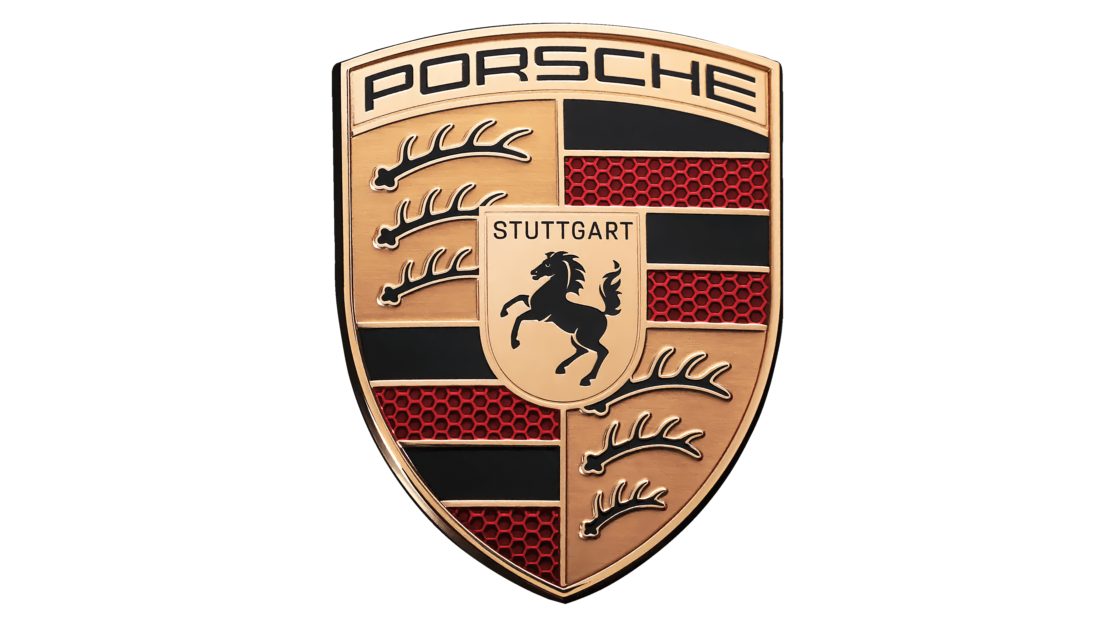
Now let's move on to another area, that of luxury vehicles. Several European brands have opted for logos with shields, including Porsche. At first glance, the Porsche logo is quite complex: the use of three different colors, the mention of the company name, a horse in the center and deer antlers. However, it is important to mention that shield logos provide an opportunity to pay homage to a particular region and this is exactly what Porsche has done. The Porsche logo is composed of both the coat of arms of the city of Stuttgart and that of the Württemberg region.

Harvard
Another example of a prestigious entity using a shield logo is Harvard University. As mentioned, many institutions that were founded decades ago opted for this style of logo. In addition, the shield can be considered a symbol of excellence, which works perfectly in this case. The Harvard University logo is composed of a red wine shield with three books. In each of the books is inscribed a part of the Latin word Veritas, which means truth. It is estimated that the first sketches of this emblem date back to the 17th century.

FC Barcelona
It is not only in the field of education that we find several logos, badges and shields. If you take a look at professional sports teams, you can find several good examples, including the emblem of FC Barcelona. First, this football team stands out by having chosen a slightly different shield shape. Second, it is once again a tribute to various important components of the region. In the upper left-hand corner, the cross of St. George, the patron saint of Catalonia, is displayed. Then, on the right is the coat of arms of the city of Barcelona. Finally, at the bottom are the club's colors, with a ball.

In conclusion, we hope to have given you what you need to know in order to use the shield shape when it is time to consider your logo design. In addition to giving a more serious and prestigious side, it is an option to consider when wanting to stand out and add several distinctive and representative elements.
If you're looking for more ideas, feel free to check out the logo templates offered on FreeLogoDesign!
More tips and tricks on the blog


