Blog
The Origin and Evolution of the Burberry Logo
It was during a trip to London that I noticed the importance of the Burberry brand in England and the world. This famous century-old British brand has been in the news over the past few years, having not just one but two logo redesigns. What for? Let's take a closer look at the origin and evolution of the Burberry logo over the years.
A few words about the creation and origin of Burberry
In 1856, the young Thomas Burberry created a raincoat that met his needs, but above all the English climate. Over the years, the draper perfected his art and created gabardine, a kind of fabric that protected him from the cold as well as from the rain. His products quickly became very popular. The founder even managed to obtain contracts with the army who wanted new quality uniforms for their officers. Originally, Burberry was written Burberry's until 1998.
Burberry stood out by associating with important explorers of the early 20th century, such as Roald Amundsen. Then, coats and raincoats also managed to carve out a place of choice among the inhabitants of Buckingham Palace. Several members of the royal family adopted the clothes created by Thomas Burberry and his sons. It was finally in 1924 that Burberry decided to put his famous beige tartan at the center of his creations. This motif remains the basis of the brand's identity to this day.
Over the following decades, the English company diversified their products and sales around the world, becoming one of the most well-known and respected English fashion brands, at least until the 2000s when Burberry was associated with troublemakers. It would then take a moment to restore the image and continue momentum.
Burberry's first logo and the meaning of the knight
Now let's move on to the topic at hand: Burberry's logos. Over the past few years, we have written many articles about the logos of luxury brands, and we have noticed that these emblems do not change or very little. Unlike the Chanel or Louis Vuitton logos, there have been five logos for Burberry since its founding.
The first logo of the English brand was shown for the first time in 1901. Nicknamed the Equestrian Knight, it was a combination logo, a type of logo made up of both the company name and a symbol. The mention Burberry and Established in 1856 in capital letters in a serif font completed the whole logo.
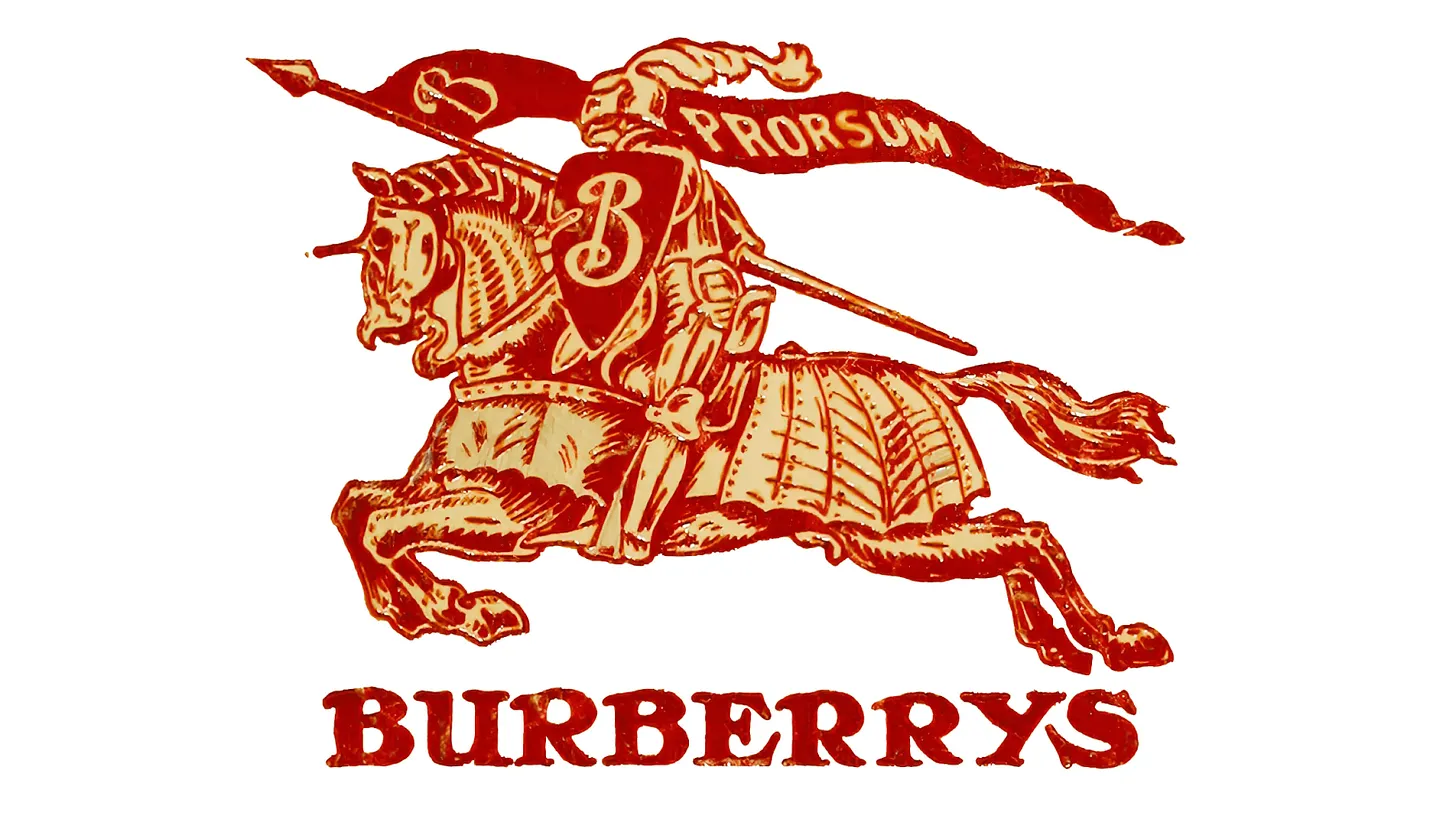
But what is the meaning of the famous knight? Burberry chose this symbol because it represented protection and integrity, two core values of the company. We can also see a man holding a lance with banner that has a B and the Latin word Prorsum on it. The B was simply a reminder of Burberry, while Prorsum, when translated, means forward.
Burberry's evolution and redesigns over time
It was in 1968 that Burberry first redesigned their logo. It also coincided with the brand's desire to make themselves better known outside of England and to refresh their look so that they appealed to younger generations.
That is when it was decided to use only the silhouette of the knight, removing all its details in the process. The typography was also drastically changed: the capital letters were removed and a more refined serif font was selected. Finally, underneath was 'OF LONDON' to show the origin and use it as a guarantee of quality.
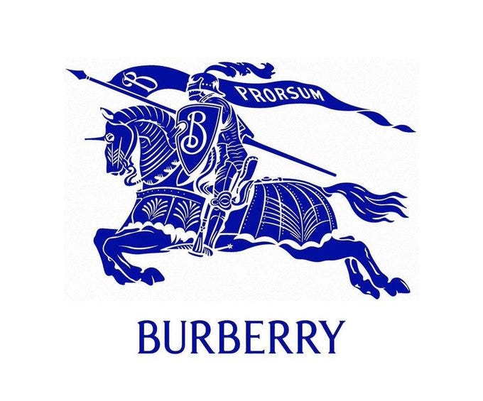
Later, important changes within the company required a new visual identity. Burberry therefore introduced a new logo in 1999, drawing a lot of inspiration from the first emblem. A more detailed knight was back, and only capital letters were chosen to introduce the name. In addition, the new, serious, upscale serif font had more space between each letter. Finally, the mention under the logo was simplified to only 'LONDON'.
Change of course in 2018
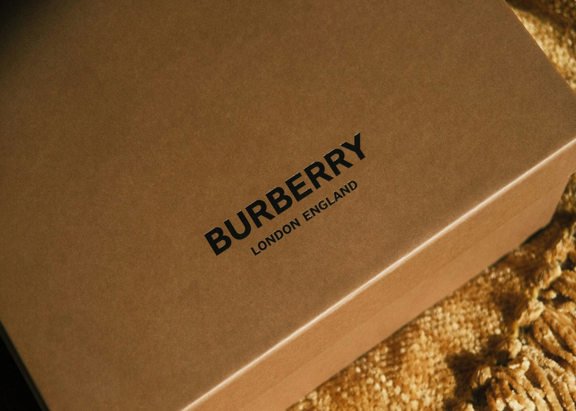
With the arrival of a new creative director, Burberry wanted a new, more modern brand image in 2018. So, everything was simplified: the knight disappeared, and they decided to opt for a sans serif font this time. However, a reference to the place of origin was kept as a distinctive part.
Unfortunately, by stripping the brand of all the components related to the latest logos, the result seemed to lose its personality and identity. It was easy to confuse Burberry's logo with other luxury brands using the same kind of logo, especially one of Yves Saint-Laurent's redesigns.
A new redesign in 2023
It seems that Burberry realized that its new logo was not up to the task. Five years later, the famous British brand decided to go ahead with another redesign. This time, a combination logo where the name and symbol could be used on their own. The original knight was also back, with all its details. They also went for a new serif font that had an elegant look and followed the latest trends in typography.
It's in the colors where we see the biggest change. Black has been the brand's base color for decades and this time they decided to use blue. Is this redesign a success? Opinions are mixed, but Burberry's new logo seems preferable to the previous one. However, it would have been a perfect opportunity to arrive with a simplified knight to better meet today's expectations.
In conclusion, what can you do to get inspired by Burberry when creating your logo? First, think of a strong symbol that represents your values. Even after 100 years, the knight remains closely associated with the brand and its values. Then, if you're thinking about doing a redesign, don't forget to keep consistency between the different emblems.
Would you like to learn more about the history of luxury brand logos? Don't hesitate to check out our blog to find articles that can help you find ideas for your brand image.
More tips and tricks on the blog

