Blog
What Are the Most Popular Colors for Logos?
If you've just launched your business, chances are you're looking for ways to stand out, while still showing your values. In this regard, colors can make a big difference as it remains one of the important pieces of your brand image. So, what are the most popular colors for logos? Is it a good idea to choose a shade that is already used by many companies?
What are the three most used colors for company logos
To begin with, do you know what the most used colors for business logos are? Look around and notice the emblems of the brands you prefer. Do you see anything? In order, blue, black and red remain the three most popular colours. Let's see why, but especially what they mean.
First place: blue
Unsurprisingly, blue is the most used color for logos in general, but why is that? In addition to being the favorite color of a large number of people, it is everywhere as it is the hue of the sky and sea. It's also a cool color, which means it has calming effects.
Regarding its meaning, blue is a color associated with knowledge, but also with fidelity. It is also the color chosen by several brands that address a wide target clientele. Like jeans, blue is a shade that is for everyone.
Examples of well-known companies using blue as their main color: Facebook, Walmart, Ford.
Second place: black
It's true that purists will say that black is technically not a color, however it's still the second most used shade for company logos. Black can add an elegant and serious touch to your brand image. It is therefore common to see luxury brands choose this color for their emblem, for the purpose of minimalism and modernity.
In Western cultures, black is often used to represent death and night, two rather negative elements. However, we must not forget that this shade is timeless.
Examples of well-known companies using black as their main color: Adidas, Chanel, Jack Daniels.
Third place: red
Finally, on the third step of our podium of the most popular colors for logos is red. In addition, it is common to see this warm color used with blue.
There are many things and emotions associated with this hue. Red is the color of passion, of love, but also of anger and impulsiveness and danger. It is a color that also has the particularity of attracting attention easily, which can be a plus if you have just created your business.
Examples of well-known companies using red as their main color: Netflix, McDonald's, Coca-Cola.
A few tips to stand out when using a popular colour
Just because a color is popular or already used by several brands doesn't mean you must choose another color for your logo. However, you need to know how to use it cleverly. Let us give you a few tips on how to stand out and make your logo a success when you want to use blue, black or red.
Choose an original shade
Here's our first tip: why not choose a shade that isn't already used by large companies? One of the characteristics of colors is that they are made up of dozens of different tints.
For example, instead of relying on the blue already used by Facebook, why not opt for a more purple or green shade? Darker or lighter? Try it out. Also, if you notice that your competitors are all using the same type of colors, it might be worth choosing something different.
Focus on the other aspects of your logo
Color is just one of the components that make up your logo and branding. Therefore, if you want to use blue, black or red, to stand out you may need to highlight the other visual components, such as the font or symbol.
In fact, by choosing an impactful font that represents your values well, you will have the opportunity to attract attention or target the right people. Take the time to choose the typography that will give the look you want for your logo.
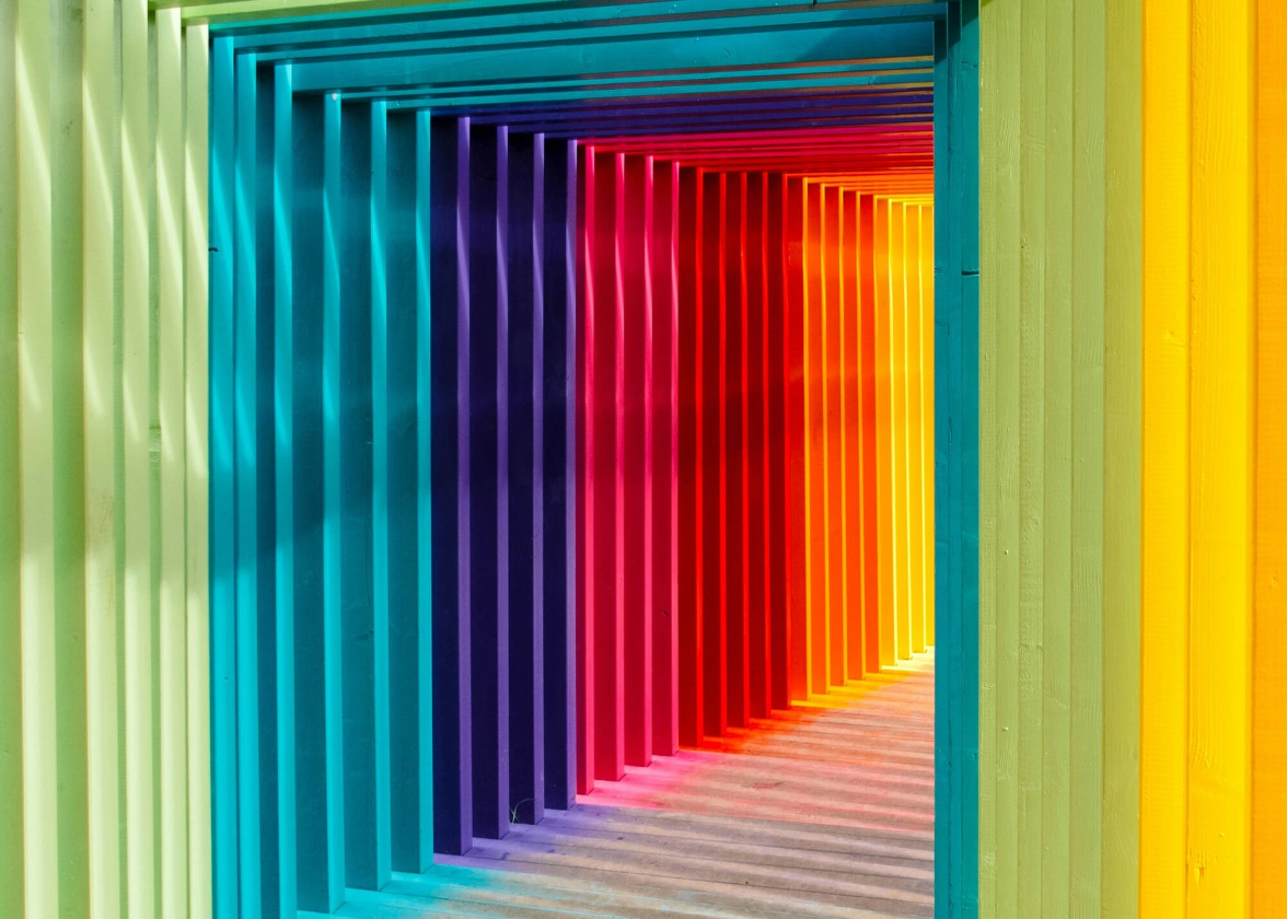
Think about color gradients
Our final tip: if you want to choose a popular color for your logo, why not use a gradient? In addition to being a common trend for logos in recent years, this can be an original way to use blue, black, or red. It's up to you to decide if you want to use two shades of the same color or two different colors.
There are different ways to achieve a color gradient when creating a logo, however what is advisable is to use two colors that follow each other on a color wheel or two rather similar shades. Again, feel free to try several times until you find the perfect combination.
In conclusion, blue, black, and red are the three most popular colors for logos, whether for businesses, fashion brands, or sports teams. These are shades with very specific meanings, so you need to make sure that they represent your values if you want to use them. And just because you decide to use these colors doesn't mean you won't be able to successfully create a logo that stands out.
Would you like to know more? Check out our pages on the meaning of colors. This will help you find the perfect shade for your logo!
More tips and tricks on the blog