Blog

Creating a Logo Using an Acronym: Tips and Tricks
It can be difficult to come up with a perfect name for your business. Some people will use a random word in the dictionary, while others will think about using a play on words or mix different terms. If you're thinking about using multiple words or your personal name, have you thought about an acronym? Let us give you some tips on how to create a logo using an acronym.
What is an acronym?
Before we get started, it might be a good idea to explain exactly what an acronym is. According to the dictionary, an acronym is a syllabically pronounced word formed from the initial components of a string of words or a name. In other words, an acronym is made up of the first letters or syllables of several words to create something shorter.
Several well-known companies have chosen to use an acronym for their business names to simplify everything. Absolutely, it is easier to remember the acronym BMW than Bayerische Motoren Werke.
Why create a monogram logo
If you're thinking of using an acronym, you should know that there is a type of logo for it: monogram logos. Consisting of only a few letters or numbers, they are relatively simple emblems that emphasize the company's name. If you want to use an icon, then it would be a combined logo. If, on the other hand, you want to display the full name of your company, it would become a signature logo.
But why choose a monogram logo for your brand? As mentioned above, this could be a great option if your business name is long, and an acronym was appropriate, and you want something relatively simple.
What to keep in mind when creating a monogram logo
If you're interested in creating a monogram logo, what should you keep in mind to ensure that the result lives up to your expectations? We found three important components that deserve special attention.
Choose the right font
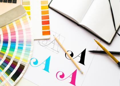
Since monogram logos are rather minimalist, it's essential not to choose any visual component at random. Every decision must be thought out and in line with your values. For an acronym, since there is no symbol, it is important to choose a font that reflects the personality of the brand.
Are you looking for something modern or more traditional? Do you want something that looks like your handwriting? Whatever you choose, the acronym must be easy to read. You will also need to decide whether you want to use uppercase or lowercase letters depending on the style you want.
Play with the different letters
Just because you decide to create a logo from an acronym doesn't mean it has to be boring or linear. Therefore, during the creation process, arrange the letters in different ways. You could duplicate, rotate, align them vertically, etc.
In fact, there are many iconic monogram logos. We'll see some examples a little later, but you only have to think of the emblems of brands like UnderArmour, the New York Yankees or Givenchy to get ideas.
Focus on relevant colours
Finally, colors remain one of the most important components of logos, even monogram logos. Although many brands choose black as their main color, it is by no means an obligation. Select the shade that best represents your corporate values. You may also want to choose a colour that is not widely used in your industry to stand out from the competition.
If you're interested in learning more, FreeLogoDesign has created a page specifically dedicated to the meaning of colors. Everyone knows that red is the color of love, but did you know that purple is associated with spirituality and royalty?
Three examples of logos that were created using an acronym
There are hundreds of brands using acronyms for their logo. Here are three examples that we find are a success.
Yves Saint-Laurent
The first logo we want to show you is that of Yves Saint-Laurent. Although now the brand is introduced as Saint-Laurent, the famous acronym YSL can still be found on many items. In this instance, the acronym was used because the designer's name was a bit too long. Also, the same typographic font was used for both the signature logo and the monogram logo. Unlike other luxury brands, Yves Saint-Laurent stood out by choosing to align the letters vertically.
IKEA
If I ask you if you have Ingvar Kamprad Elmtaryd Agunnaryd furniture at home, you may not know what I'm talking about. This is simply the names behind the acronym IKEA. This is because IKEA is made up of the name of the founder and the place where the company was founded. Previously, we discussed the importance of colors and although the IKEA logo is simple, it quickly becomes clear that this is a proud Swedish brand.
H&M
Another Swedish brand has also opted for an acronym for its official brand name. Originally known as Hennes & Mauritz, it has been simplified over the years to become the H&M chain of stores. The H&M logo is simple, yet impactful thanks to the use of a vibrant and youthful red. The font also helps to give the desired trendy look.
Learn about the history and evolution of the H&M logo over the years.
In conclusion, it is most certainly possible to create a beautiful logo from an acronym. In this regard, monogram logos remain the most relevant option, although it is possible to explore other options if necessary. Remember to pay close attention to the choice of font, the layout of the components, and the color palette. Don't hesitate to experiment until you find the perfect combination!
More tips and tricks on the blog


