Blog
The Evolution of the Nissan Logo Over Time
Japan is recognized for having many car manufacturers. Brands such as Toyota, Honda, Mazda and Mitsubishi are sold internationally and have a reputation for offering quality vehicles, but above all reliability. In this article, we will analyze the history and the evolution of the Nissan logo, another Japanese car manufacturer that has been going to strong.
A few words about Nissan and how this company was founded
Nissan or Datsun? How was Nissan created? To start, we must tell you that Nissan's history has included significant challenges, which probably explains the amount of different logos over time.
Previous to having the name Nissan, Kaishinsha Motorcar Co in Tokyo was founded in 1911. In 1926, this company merged with another Japanese manufacturer and took the name DAT Jidosha Seizo Co, then Datson in 1931 and Datsun in 1932. Then, in 1933, Nihon Sangyo Co bought the whole thing and decided to use the name Nissan Motor Co. The company would then build various vehicles during the Second World War and diversify in the years following. The name Datsun was used for the international market, while Nissan was chosen for the Japanese market, until 1981 when the company decided to standardize everything.
Later, in the 1990s, the company experienced serious financial difficulties. So, in 1999, an alliance with the French manufacturer Renault was created, which is still in effect today.
Nissan's first logo
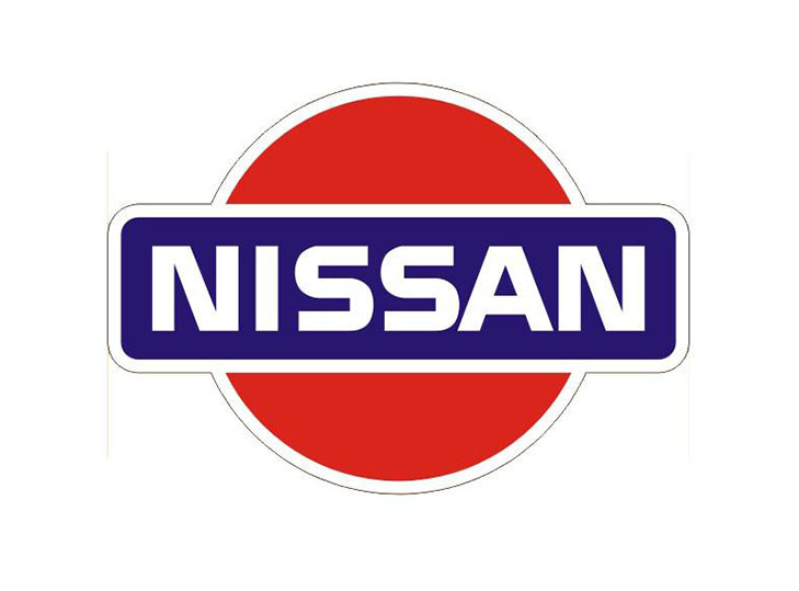
The first Nissan logo, used from 1933 to 1940, could be considered a badge logo. Halfway between the London Underground logo and the Harley-Davidson logo, this one is relatively simple. The name of the manufacturer is in a blue rectangle with a red circle in the background. This symbol is a nod to the Japanese flag.
Otherwise, on the font side, it's simply a sans-serif typography, with rather thick letters. This emblem would remain the basis for a large number of redesigns in the future.

The evolution of the Nissan brand
As mentioned above, the car manufacturer Nissan has faced many changes over the years, which has resulted in several redesigns. In 1940, the brand opted for a new logo. The blue disappeared and the background shape changed to something that could have look liked a rearview mirror. Note that the silhouette of the previous logo was kept. The letters also became thicker.
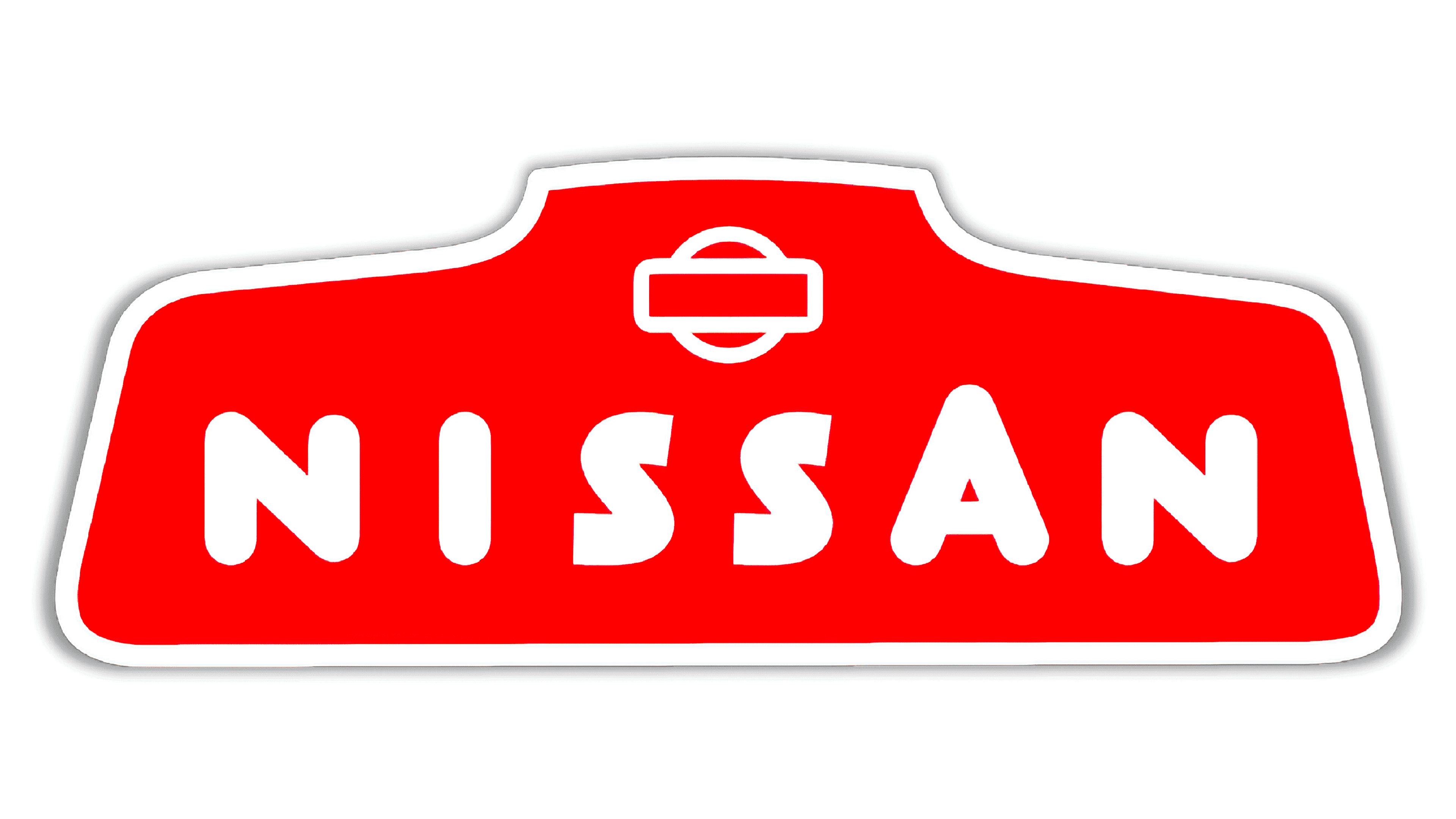
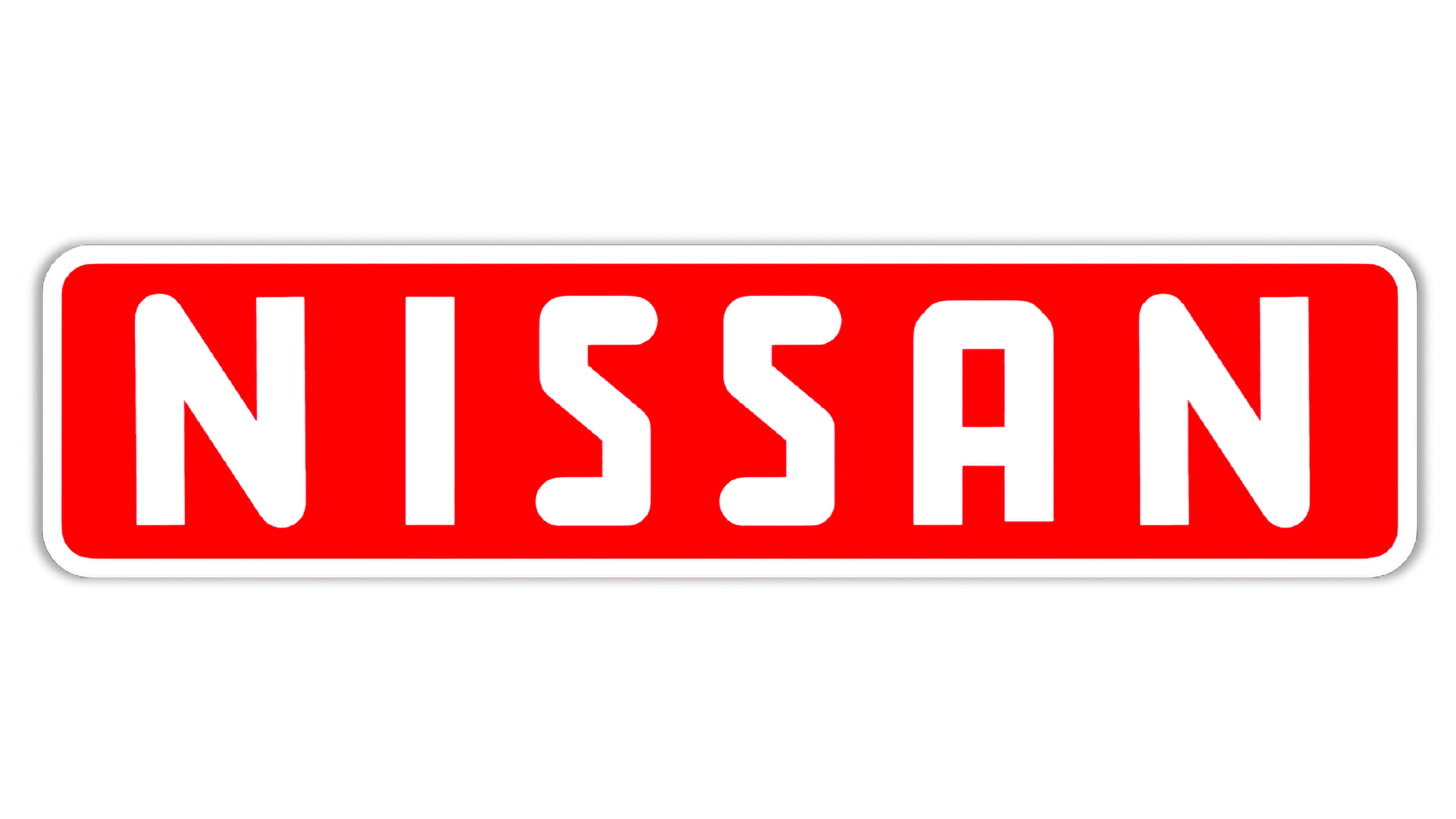
Change of mind in 1950: they decided to use a rectangular shape, while keeping the red and white color scheme, once again in honor of the flag of Japan. The special feature of this version is the use of both rounded and straight ends of the lettering. In 1959, however, only straight ends were used.
Another change in 1960. This time, they decided to go with a more handwritten, slightly slanted font, with a more distinguished effect. At this point it was a signature logo, composed only of the name of the company. Unfortunately, this version was short-lived, because in 1967 everything was replaced by a redesign using brown and beige.

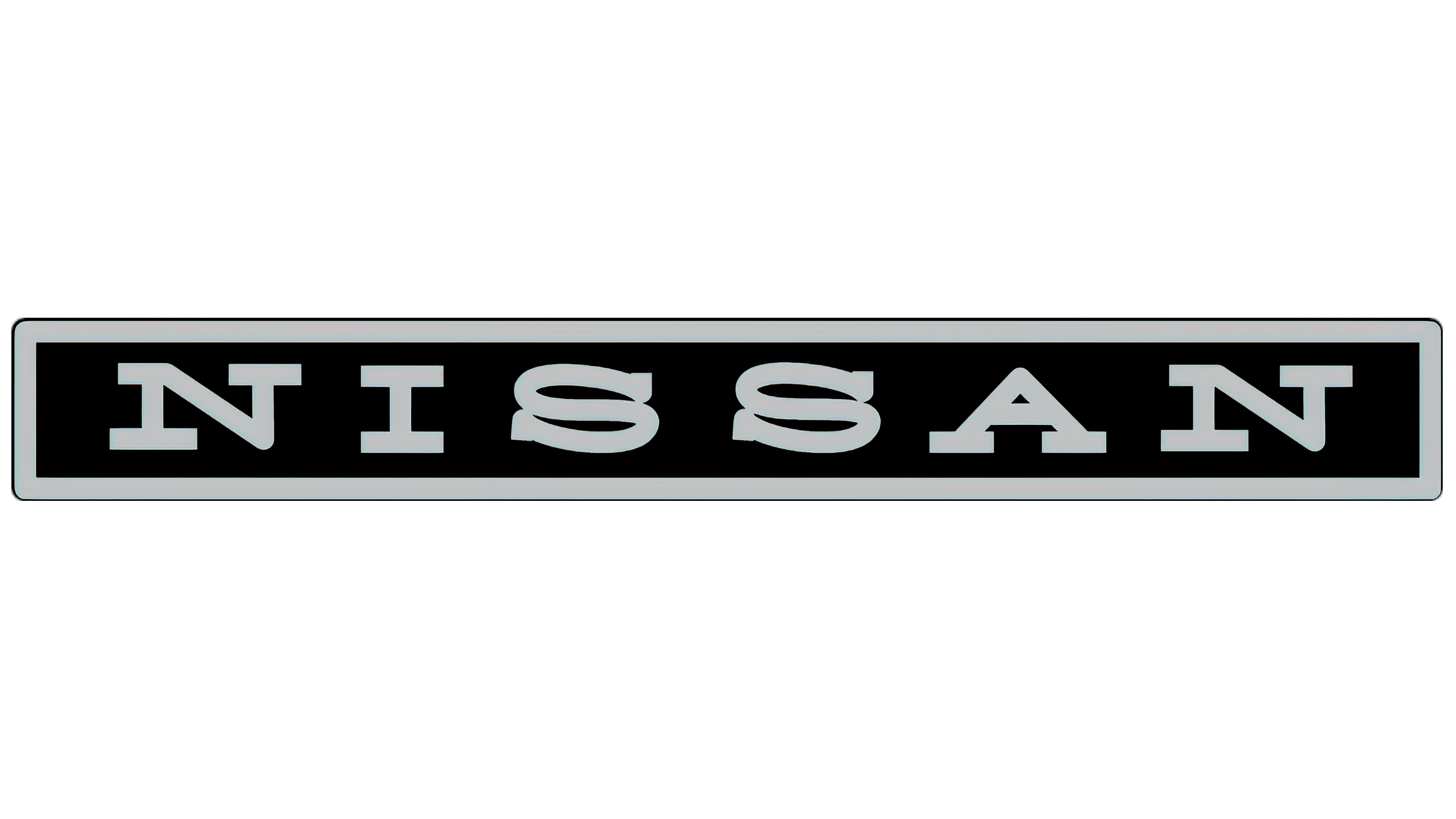
It is therefore not surprising that Nissan decided to have a new logo for the 1970s. They came back with the rectangular shape, but this time they changed the font and the colors. The car manufacturer then chose to use a serif typography for the first time. They also chose grey and black, probably to give themselves a more modern look.
Then, in 1983 they returned to their roots with a new redesign that used all the original components of the brand. Blue, red, and white are back, as well as the symbol consisting of the rectangle and the red circle. Nissan then decided to use a sans-serif font with a modern look. This version would be used until 2001.
A new millennium and a new logo? In 2001, Nissan unveiled a new redesign that followed the metal-look and 3D trends of the time. The whole thing was also greatly simplified, which helped to give credibility to the brand, while keeping the original inspirations. We have all the basic components: the rectangle, the circle and the name of the manufacturer. This version was also easier to use directly on vehicles.

Nissan's current logo
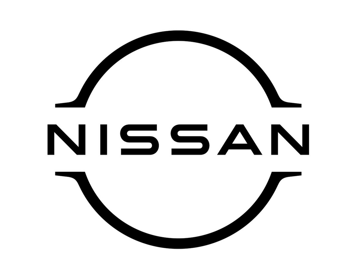
You probably already know that minimalism has been one of the most important trends in the last few years. In 2020, Nissan plunged into this trend by offering a tenth logo. This time, only the silhouette of the rectangle and the circle was kept. The chromatic grey gives way to a black and white emblem, with the brand name in the centre. It is indeed modern, but is it a little too minimal? If the trend continues, we can't wait to see what Nissan has in store for us in 2030.
What font is used on the Nissan logo?
Nissan uses a custom-made font called Nissan Brand. It has different variations to have thinner or thicker letters. This allows the brand to be more flexible.
In conclusion, how can you draw inspiration from the Nissan logo? First, the car manufacturer was able to use details related the place where the company was founded, both in terms of shape and color palette. Second, when the company underwent significant changes, it simply redesigned its visual identity to adapt to new trends.
Would you like to know more about the meaning of other car manufacturers' logos? We invite you to take a look at our blog to find articles on the emblems of brands such as Alfa Romeo, Toyota and BMW.
More tips and tricks on the blog


