Blog

What Is the Meaning of the Subaru Logo?
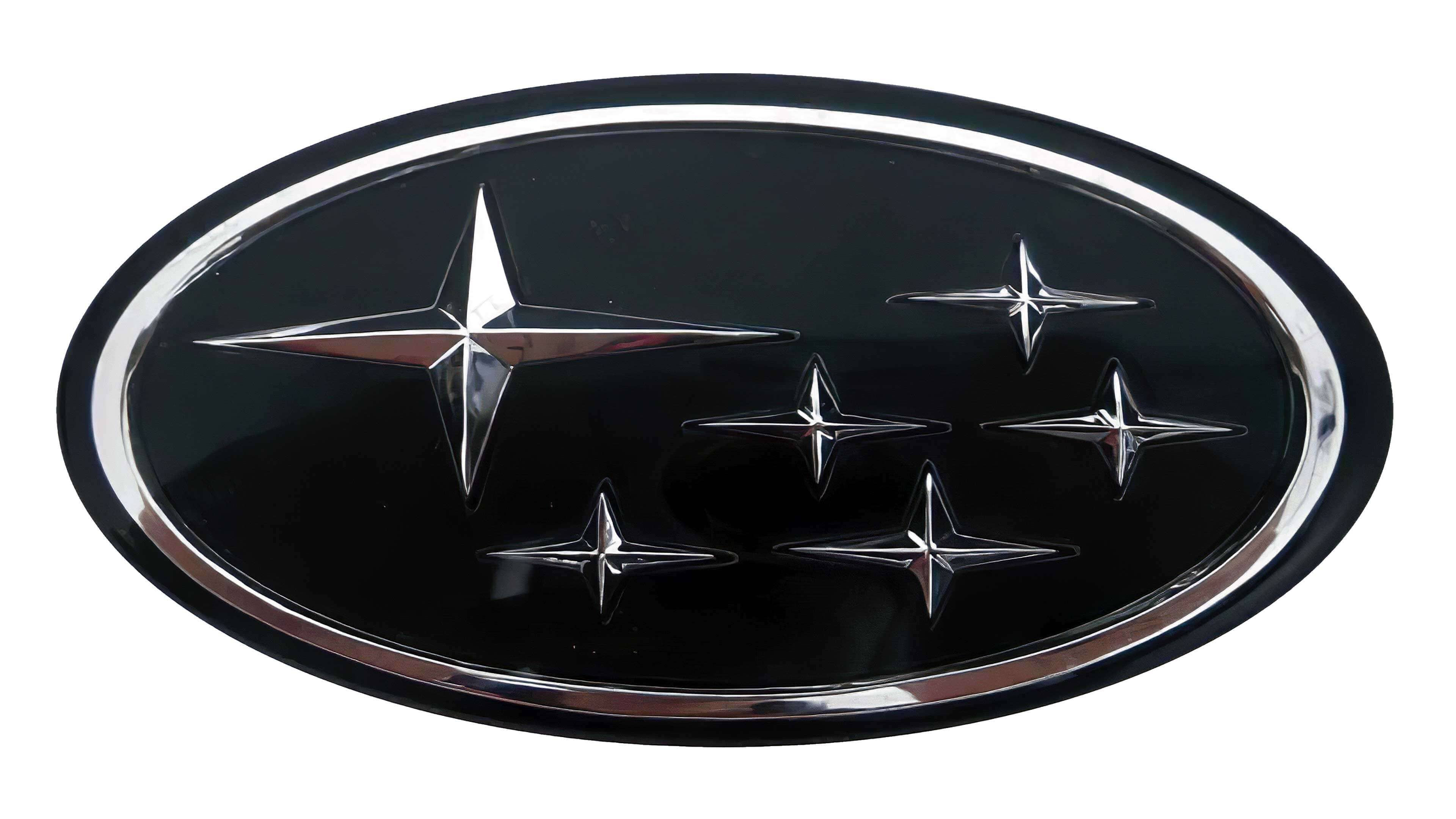
Out of the many types of logos that we particularly like to analyze are those of car manufacturers. They must have a strong, distinctive, and simple brand to stand out. In the last few months, we have featured many Japanese brands like Nissan or Toyota, but what about Subaru? What is the meaning of the Subaru logo and why did the company choose stars as its symbol?
A few words about how Subaru was founded
Initially, the company behind Subaru specialized in aeronautics. After the Second World War, they decided to start designing engines and vehicles. Unfortunately, in the 1950s, the Japanese company had to split up to comply with new laws.
Then, five of these new entities and a corporation decided to join forces in 1953 to become Fuji Heavy Industries. Thanks to the knowledge of each member, they developed their first vehicle together. It was at this time that Subaru was officially created.
Over time, the Subaru brand achieved international success thanks to its all wheel-drive technologies, reliability and participation in numerous rallies.
What exactly does the word Subaru mean?
You probably already know that it's not easy to find the perfect name for your business. However, it's safe to say that Subaru has hit the nail on the head. But what exactly does the word Subaru mean?
First, Subaru is the Japanese name for the constellation Pleiades. Its distinctive feature is that six of its stars that can be seen with the naked eye. When the brand was formed, it was made up of six different companies. Note that the term Subaru can also be used to mean the verb ‘to come together’ in Japanese.
The origin of Subaru's first logo
The first Subaru logo was used as early as 1953. There are two important components of the brand: the six stars, as well as the oval shape. It should be noted, however, that the location of the stars was a little different from today's logo, but more faithful to the constellation. Different color combinations were also used. There is a black and white version, a silver and a gold version. Different versions were created and used until 1980.
 (1).png)
The evolution of the Subaru brand over time
It was in 1980 that the redesign was born, which would be the basis of the logo used today. Subaru took the different components and replaced them so that there was one larger star and five smaller stars on the right. The Japanese automaker also opted for a combination of silver and blue, a bit like Ford's logo. It works, because based on the meaning of the colours, blue remains the colour associated with reliability and confidence, two important values at Subaru. It is also the color of the sky, which makes it another reference to the constellation.
In 1999, Subaru decided to update their logo for the arrival of the new millennium. Although similar to the previous version, there is a certain 3D and domed effect, aspects of logos that are very common from the 2000s.

Finally, in 2003, there was a decision to switch from a badge logo to a combined logo by adding the name of the company under the symbol.
.png)
In our opinion, it wouldn't be surprising if Subaru decided to introduce a new redesign in the next few years. Recently, many car manufacturers have opted for simplified and minimalist versions without a 3D effect or chrome. To be continued!
What font does Subaru use?
Subaru chose a sans serif font and capital letters for its company logo. The colour used is also black. It is said that the exact font used by the brand would be Square 721 Std Bold Extended.
How to take inspiration from Subaru when creating your logo
Now, how can you be inspired by Subaru when creating your logo? First, whether it's for your symbol or business name, think about finding something relevant and representative. In the case of Subaru, the name and constellation represent the association of the six entities with the aim of creating a new automaker in the market.
Next, we would like to mention the importance of choosing the right symbols and icons. In this case, the star is associated with excellence. Also, Subaru has chosen to use a four-pointed star to differentiate itself from other brands such as Mercedes-Benz or even Chrysler. Don't hesitate to choose something slightly different to stand out from the competition and build a strong brand.
Finally, it is vital that you choose the colors of your brand strategically, as they have meaning. As mentioned above, blue is a popular color associated with the values of reliability and trust, which works very well for a car brand. The use of silver can give a modern touch to an emblem.
In conclusion, now that you know the meaning and origin of the Subaru logo, you may not see this emblem in the same way. It's safe to say that the designers and management did a very good job at finding a symbol that represents them well from multiple angles.
Mergers and alliances at car manufacturers are something quite common. For example, did you know that the four circles in the Audi logo represent four brands that have merged over time?
More tips and tricks on the blog


