Blog

Create a Gold Logo: Is It a Symbol of Luxury or Outdated Fashion?
There are several steps to follow when creating a logo. After doing your market research and identifying your desired style, you will need to choose different visual elements. Among these is the color palette. Which shade best represents your brand? What about gold? Is it still relevant to use gold for a company logo or is it a fad to avoid?
The meaning of gold in logos
Before we say if gold is still a color that’s in trend, what about its meaning? What exactly does this shade represent?
As you might expect, gold is a color highly associated with wealth, money, and luxury. The reason is quite simple: it is the colour of one of the most coveted metals even today. Gold has been used for hundreds of years for coins, but also for jewelry and accessories worn by the wealthier classes. It is also a colour intimately linked to excellence. Just think of gold medals that are awarded to competitors in first place.
Otherwise, as with yellow, it is also a warm color associated with the sun.
The Benefits of Creating a Gold Logo
So, why would a brand choose gold as the main color for its logo? First, as we have just seen, this shade is closely associated with luxury. So, if you offer high-end products or services, this could be an option. In addition, remember that yellow is not the most used color for company logos. This could be an opportunity to stand out.
The disadvantages of creating a gold logo
Unfortunately, gold logos don't have all the advantages. They've been used a lot in recent years, which can show a lack of originality. Also, too much gold can make your brand look tacky. In other words, it's important to know how much to use. Finally, one of the major disadvantages of gold lies in the printing process. It's not always easy to get the shiny gold effect on printed documents. Sometimes, it looks more brown than yellow.
So here's a tip: it's possible to use gold as the main color for your logo, but consider including other hues to create accents and contrasts.
What color code should I use if I want to create a gold logo?
If you're using an online tool like FreeLogoDesign to create your logo, what color code can you use for gold? For a bright yellow, the hex code #FFD700 may be a good start.
If you want to print posters or business cards and have the shiny effect, don't hesitate to contact your printer to see what options are available.
Four Great Examples of Gold Logos
Since it's always easier to come up with ideas by seeing examples, we've found four examples of brands using gold for their logos. This will make it easier for you to decide whether it is a good color for your business or not.
The Golden Knights of Las Vegas
The city of Las Vegas is highly associated with casinos and wealth. So, it's no surprise that gold is the main color and even the inspiration behind their hockey team's name. It is a shield-shaped logo where gold and black are used to create an interesting contrast. Did you notice the presence of the letter V in the helmet to represent Vegas? All in all, a well-made logo!

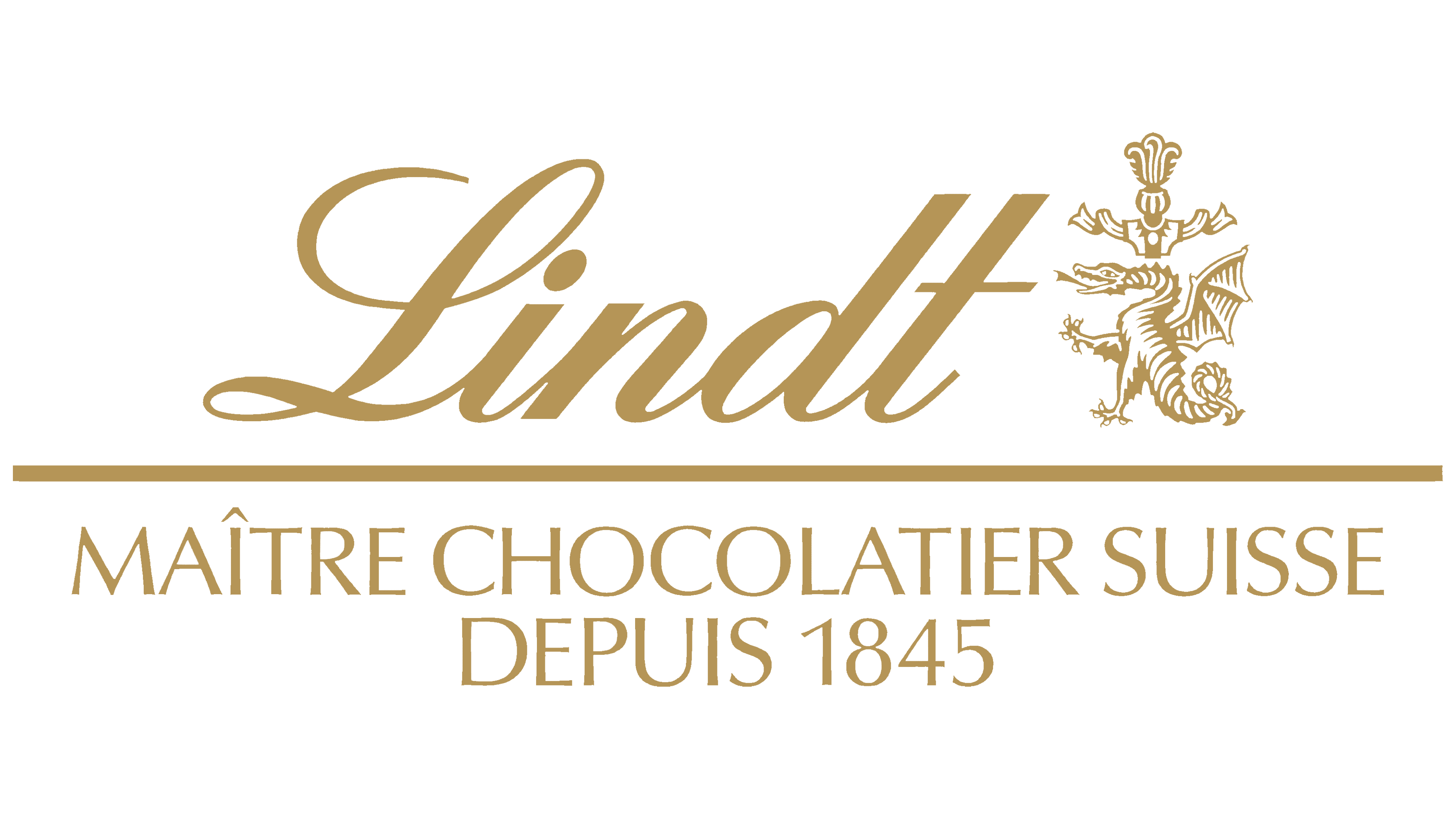
Lindt & Sprüngli
When you are an expert in your field, you may want to use gold as the main color of your brand. This is what the Swiss chocolate manufacturer Lindt & Sprüngli, better known by the abbreviated name Lindt, did for their combined logo, but also for some packaging. They have been claiming to be master chocolatiers since 1845, and their reputation is well established. In addition, gold works well as chocolate has long been considered a luxury.

Lamborghini
If we stay in the world of luxury brands, several car manufacturers have chosen gold as the color for their logo. Among the best known is the Italian company Lamborghini. Although the gold has been softened during a recent redesign, this shade remains associated with the manufacturer. Again, the use of the combination of black and gold brings distinction and contrast.

The logo of the Paris 2024 Olympic Games
Finally, let's end with a golden logo that also represents excellence: that of the recent Paris Olympic Games. In this instance, the color and the shape of the circle were used to represent the gold medal, the highest distinction one can receive. The fiery silhouette is also a reminder of the Olympic flame, which again works with our warm color. The logo is also a nod to Art Deco, an artistic style that often uses this hue.
In conclusion, should you use gold as the main color for your logo? It depends on what you're looking for. As we have seen before, you have to be careful not to fall into clichés or excess and to make sure that the whole thing does not turn brown once printed. Despite everything, gold remains the ideal shade to represent wealth and excellence.
To make an informed choice, we invite you to discover the meaning of colours.
More tips and tricks on the blog


