Blog
The History and Significance of the McDonald's Logo
Instantly recognized around the world, the McDonald's logo embodies one of the most successful brand images ever created. From its modest beginnings to its current minimalist design, this logo is a perfect example of how a symbol can evolve to reflect a company's history, values and ambitions. Discover in this article the major transformations of the McDonald's logo and the story behind the restaurants that have marked generations for over 80 years.
The beginnings of McDonald's
Opened in 1940, the restaurant was the second business opened by the McDonald brothers, Maurice and Richard. At the time, their offering specialized in barbecue cuisine. However, in 1948, the brothers decided to focus on a product that was growing in popularity in the United States: hamburgers, thus responding to consumer demand.
A few years later, Ray Kroc bought the company, seeing an incredible business opportunity in the McDonald brothers' way of operating. The key to their success? Their limited menu, which optimized the efficiency of kitchen staff and sped up order preparation. Under Kroc's leadership, the company rapidly expanded to become the world's leading fast-food chain.
The first McDonald's logo
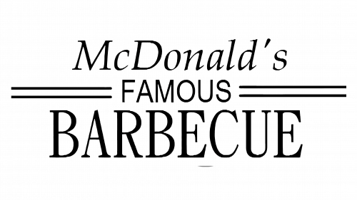
The first McDonald's logo dates back to 1940, when the company was called McDonald's Famous Barbecue and was still owned by the two McDonald brothers. The initial logo used two different fonts, one sans-serif and one serif, and the size of the word “barbecue” effectively emphasized the restaurant's specialty. It was simple, but effective: the straight lines evoked the marks left by the grill on the meat, a direct reference to barbecuing.
The evolution of McDonald's brand image over the years
As mentioned above, hamburgers quickly became a staple meal in the U.S., prompting the McDonald brothers to adapt their menu. They also took the opportunity to change the name of their company to McDonald's Famous Hamburger and revamp their logo. The layout of the words remained the same as the original, but that's all the two designs had in common. The font was now all white capitals on a black background. A key element of this version was the addition of Chef Speedee, a mascot illustrating the speed of service, and a slogan reinforcing this promise of efficiency.

McDonald's brand image underwent quite a change in 1953! In addition to adopting the name we still know today, the company dropped superfluous details to create a signature logo with a sans-serif font and thick lines. Red made its appearance in the McDonald's logo at this time. This design transformation was in keeping with the evolution of the company and what it wanted to project: efficiency and speed of service, two qualities for which the McDonald brothers had been known from the start.

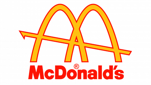
The golden arches first appeared in the McDonald's logo in 1961. Did you know that they were inspired by restaurant architecture? That's right! To stand out from its competitors, the chain wanted its franchises to have buildings with unusual architecture to draw attention to its branches and make them easily recognizable. Their design was not limited to a simple marketing strategy: they also embodied innovation, pleasure and accessibility, three values at the heart of the brand. This version of the logo also incorporates changes to the typography. Clearer and easier to read, it reflected a desire to make commerce accessible to all. This was also when yellow made its appearance. Red was kept for the outline and the company name under the logo.
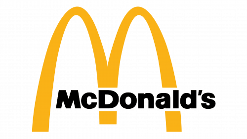
The arches were modified with the new version of the 1968 logo, and now look more like an “M”. They thus become the central piece of the McDonald's brand image. The positioning of the restaurant's name was also changed to be integrated right into the golden arches.
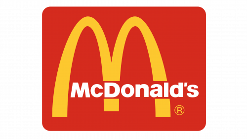
A few years later, in 1983, the logo evolved further with the addition of a red box behind the yellow “M”, a variation that accentuated the modernity of the design while increasing its visual impact. The font then changed from black to white, optimizing contrast and making the whole even more legible.
Since 1993, McDonald's visual identity has been built around the monogram logo, composed solely of golden arches. The yellow “M” of the arches, accompanied by its black shadow, remained the fast-food chain's emblematic symbol for some twenty years. This new variation of the logo indicated the company's willingness to follow current trends and its ability to adapt to its clientele. In 2003, the shadow was removed to give full prominence to the arches.

The current logo
The current McDonald's brand image features a minimalist logo, the iconic yellow letter “M” in a square with rounded corners. When the slogan accompanies the logo, it is written in the font created specifically for McDonald's, Lovin' Sans, which are always in lower case. It was chosen so that it could be easily read by everyone.

The colors of the logo, yellow and red, were carefully selected to evoke positive emotions. Yellow, a symbol of happiness and fraternity, combines with red, which evokes energy and appetite, central characteristics for McDonald's. Together, these colors reflect the brand's key objectives: to offer a joyful, unifying and fun experience.
Today, the famous McDonald's logo is more than just a graphic symbol. It embodies speed and reassures to consumers around the world: wherever they are, they can expect a consistent, familiar experience in every McDonald's restaurant.
The evolution of the McDonald's logo shows that good design combines simplicity, adaptability and emotion. Use it as inspiration to create a logo that reflects the essence of your brand, while remaining timeless and memorable. A successful logo is the key to making a lasting impression and building a strong identity.
Would you like to know more about the components to consider when designing a strong brand image? Feel free to visit our blog to read articles that will give you ideas for creating your logo.
---
Roxane has always written and dreamed of making a living from her pen. Now a web editor, proofreader and author, we can say that it's mission accomplished!
More tips and tricks on the blog


