Blog

The meaning of colors
It is very important to know the significance of certain colors before creating your logo, because color is such an integral part of your design. Choosing the right color palette for your business, the one that will convey the right message, is a crucial step. It is obvious that some colors are more appropriate than others for certain fields of activity; for example, we rarely see a bright pink logo for a law firm. To choose the best colors for your logo, you can rely on this guide, which explains the meaning and significance of colors!
Warm Colors
Warm colors inspire energy and optimism. They motivate us, and they are very sympathetic colors. Choose them to add dynamism to your design and to capture attention.
Red
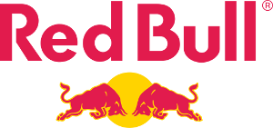
Red is a color that symbolizes intensity. It can mean both love and anger. Indeed, red is a color of contrast; It can inspire love and passion, just as much as it can mean blood and hell. In design, red is used to capture attention and signify intensity, for example, in the Redbull logo.
Orange
The color orange mainly means creativity and dynamism. It’s similar to red, but orange gives a more youthful and fun tone. It can also represent communication and open-mindedness. In the world of design, orange is used in logos for its playfulness and optimistic side. For example, in the Fanta or SoundCloud logos.

Yellow
Yellow is a joyful and stimulating color. It is often used to represent friendship and fraternity. Yellow inspires happiness and is captivating. For these reasons, it is used in logos like McDonald's and Snapchat. The yellow is also being used for construction logos.

Cold Colors
Unlike warm colors, cool colors inspire calm and serenity. They give us a freshness vibe: use them to inspire confidence for your customers.
Green
This nature-inspired color is very soothing. Green can represent money, health, luck or the environment, depending on its use. One thing is for sure, green breathes tranquility, and hope. In logos, it is often used to represent environment-friendly businesses or for banks.
Blue
Statistically, blue is the most popular color, it’s the one that is the most people on earth’s ‘favorite color.’ This explains why it is the most used color in logo design. Blue inspires calm and confidence, as well as safety. It also represents loyalty and loyalty. In logo design, blue is regularly used in health logos for its sense of security and the fact that it reflects good hygiene.
Purple
Purple is the color of mystery and melancholy, but it can also represent royalty and luxury. This color is often used in educational logos, or religious institutes. It is also regularly used to represent chocolate brands.
We hope this will have guided your logo creation. Of course, several other factors are to be considered like your target market, your business, your activity sector, but knowing some color meanings is a good starting point. The important thing is to select colors that will please you and that will match your business!
Happy logo creation :)
More tips and tricks on the blog
