Blog
15 Hidden Messages in Logos of Major Companies
Famous brand logos are not just recognizable, they often tell a story or hide subtle symbols. In this article, we are going to explore the well-kept secrets behind some of the most iconic logos. Get ready to see these designs from a whole new perspective!
Adidas
The Adidas logo, a sporting goods brand, is easily recognized by the three diagonal bars that make it up. But have you ever noticed that their difference in size forms a mountain? This design is thoughtful and symbolizes the obstacles that athletes must overcome to achieve their goals.

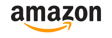
Amazon
The undisputed leader in online commerce, Amazon illustrates the scope of its offer right down to its logo. It is no coincidence that the arrow starts at the letter 'a' and goes to 'z'. This position highlights the incredible variety of products offered on the platform. It also takes the form of a smile, reinforced by a dimple drawn at the end of the arrow, which represents the satisfaction of customers around the world.
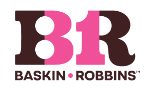
Baskin Robbins
The company is known for its many flavors of ice cream and highlights this aspect in its logo. Yes, the distribution of colors in this logo is not a coincidence! Pink is used to form the number "31," a nod to the 31 flavors originally offered by the brand. Since then, more than 1,400 flavors have been created, a testament to the company's inventiveness and history.
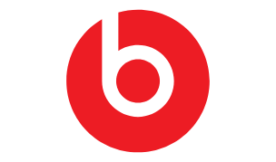
Beats
At first glance, the Beats logo is simple: a 'b' placed in a red circle. However, if you look closely, you'll notice that the circle is actually a person's head, and the 'b' is the silhouette of those popular headphones. This touch adds a new meaning to the logo, giving a human and personalized dimension to the Beats' brand identity.
Carrefour
Carrefour, a very popular chain of stores and hypermarkets in France, stands out for its ingenious logo. Quickly, you will notice the two arrows that make it up. The company has cleverly used the negative space between them to integrate the initial of its name.

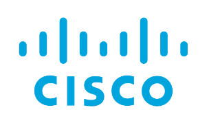
Cisco
The technology company perfectly reflects its field in its combined logo. The bands above the name represent an electromagnet, but they also have a hidden meaning. The difference in their height evokes the silhouette of the Golden Gate Bridge in San Francisco, where Cisco's headquarters are located.
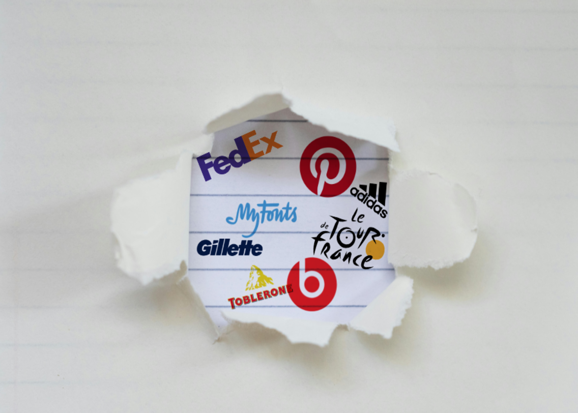
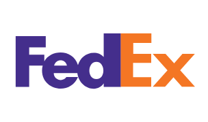
FedEx
A popular delivery service, FedEx is easily recognized by consumers. You've probably seen its signature logo on company trucks or on planes, but did you know that it contains a hidden message? An arrow can be seen in the space between the 'E' and the 'x', signifying the speed and precision of the company's service.
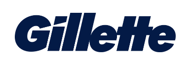
Gillette
Gillette, known for its wide range of shaving products, has cleverly integrated its offer into its logo. Look closely: the tip of the letter 'G' and the dot of the 'I' seem to be cut off, as if by a blade. This subtle detail illustrates the effectiveness and sharpness of the products, reinforcing the quality of the products.
The Tour de France
The Tour de France is a popular cycling event with a world reputation, followed by millions of spectators. Its logo has two hidden messages. The first is the use of the 'r' to represent a cyclist bent over his bike. The second, more subtle, is in the orange circle integrated into the logo. It symbolizes the sun, mentioning that the race takes place only during the day.

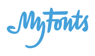
MyFonts
MyFonts is a site dedicated to finding and buying fonts. The logo incorporates a subtle message: look at the first two letters, and you'll notice a shape that looks like a hand. This detail is a reminder that users can literally 'get their hands' on the fonts they want through MyFonts.
London Symphony Orchestra
The London Symphony Orchestra's logo is simple, but its design required a lot of thought when creating the branding. At first glance, the logo displays the initials 'LSO', drawn in a single continuous line. On closer inspection, this same line evokes a conductor in full movement, capturing the very essence of symphonic music.

The social network is known for being an excellent source of inspiration and for the possibility of 'pinning' publications in collections, called 'boards'. This concept is cleverly integrated into the brand's image, and especially in its logo: the 'p' has a sharp point, bringing to mind a thumbtack, as if its users were actually going to pin ideas to their board.

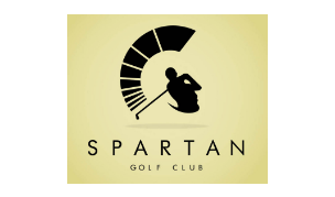
Spartan
The Spartan Golf Club cleverly plays with visual duality in its logo. At first glance, some will see the profile of a Spartan, recognizable by its iconic helmet. Others will notice the golfer taking his swing before hitting the ball. This combination of images represents the brand name as well as the sport played by the team very well.
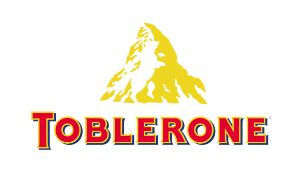
Toblerone
Symbolism is at the heart of the Toblerone logo. True to its Swiss origins, the company emphasizes the high peaks of its country in its brand image. Look closely at the pattern in the mountain to find the bear hiding in the white space. The choice of this animal is not random: Bern, the city where the company was founded, is nicknamed the City of Bears.
Tostitos
Tostitos, célèbre pour ses croustilles de maïs et sa salsa, intègre ses produits au cœur même de son logo. Observez bien: les deux «t» minuscules représentent des personnes partageant des chips, tandis que le point rouge du «i» évoque une trempette, clin d’œil à leur salsa mexicaine. Un design simple et efficace qui illustre la convivialité de la marque.
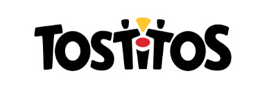
Tostitos, famous for its corn chips and salsa, integrates its products into the very heart of its logo. Look closely: the two lowercase 't's' represent people sharing chips, while the red dot on the 'I' is dip, a nod to their Mexican salsa. A simple and effective design that illustrates the user-friendliness of the brand.
Iconic logos often reveal much more than meets the eye. These ingenious details reinforce the brands' identity and captivate their audiences. Companies play with the meaning of words to produce unique visuals.
Have an idea for a new logo? Create a memorable one with FreeLogoDesign and bring your vision to life today!
---
Roxane has always written and dreamed of making a living from her pen. Now a web editor, proofreader and author, we can say that it's mission accomplished!
More tips and tricks on the blog