Blog

How to choose the perfect font for your logo
Choosing the right font for your logo is a very important step in the design, and it is certainly not something you want to neglect. Because your logo is the heart of your brand identity, it must represent it well. Plus, with all the fonts available in the free logo design editor, it’s easy to get somewhat lost. Serif, sans-serif, script, you probably have already heard these terms, but don’t fully understand there meaning. To enlighten you, we have divided the fonts into 4 categories and we are giving you some tips to make a fitting choice for your logo’s font.
SERIF
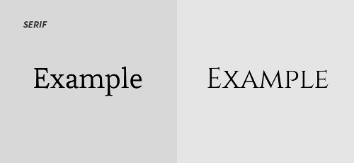
The first category of fonts is serif. Serif fonts have a serif at the end of the letters. They were created to give an illusion of a line below the letters to facilitate reading in large blocks of text like in a novel. This type of font is fairly neutral, however, they give a classic look to your logo. They also inspire reliability and tradition. Choose a serif font for a respectable and professional business, to give it a trusty side and well as a timeless aspect.
SANS-SERIF
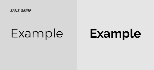
Then we have the sans-serif category. As you may have guessed, these fonts do not have serifs at the end of letters. They are simpler, and more clear since they have no ‘’lines’’. They generally have more of a modern and human look. Increasingly, companies are using sans-serif fonts for their logo redesign, since they are more web-friendly. This type of font can be used for almost any type of businesses since they are neutral. On the other hand, keep in mind that they will give a minimalist and modern look to your logo.
SCRIPT
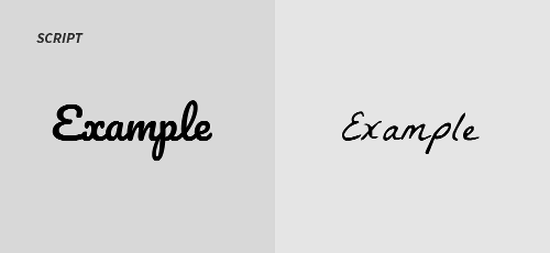
Script fonts have a more personality than the last two categories. They look like calligraphy and are softer than serif and sans-serif, they will probably give a more feminine or elegant character to your logo. However, you must be careful since script fonts are often less readable than the other two. You must, therefore, make sure to think about the use of your logo when choosing your font to be certain that your logo will be eligible.
DECORATIVE / OTHER
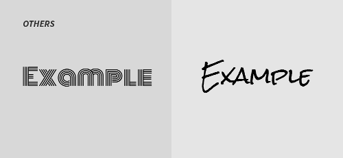
FreeLogoDesign also offers other fonts, which do not belong to any of the previous three categories. These are more decorative fonts that have more personality. Fonts more futuristic, Gothic or even ‘’childish’’, there is something for everyone. This kind of font can be very interesting to use in a logo since they have more personality, they can represent your company if they are well used. Just be careful not to fall into the "cheesy" category, since these fonts are often very flashy. Use them intelligently, combined with a very simple sans-serif font, for example.
HOW TO CHOOSE
Now that you know more about the different font categories, you can make a more informed choice. Keep in mind, pick a font you like, but take into account your business spirit and your target audience, to help you find a font that also suits your company.
Target audience
To make sure you pick the best font for your logo, think about who your logo is for. Who is the target audience of your company? The type of person you are talking to is very important when it comes to making a font choice. You will certainly choose a different font if you are a toy store than if you are a law firm since these two companies do not address the same public.
Type of company
In addition to your target audience, the police you choose must represent your business. It must fit perfectly into your brand identity because your logo is at the center of your brand. The police must be consistent with your type of business and the value you want to convey. Do you want to appear dynamic, professional, or fun? Are you a big luxury restaurant, or the local food-truck? All of this will have a big impact on the choice of your font.
COMBINE FONTS
Sometimes choosing a single font for your logo is perfectly suitable. In other cases, two fonts will be needed to create your ideal logo. Combine two fonts: one will be your main font and the other will be more secondary. To combine fonts, try to choose some that aren’t similar. Contrast is the key to a good typographic combination. You can go more conservative, combining a serif and sans-serif font or choose a more daring avenue, combining two completely different decorative fonts. No matter what you decide, make sure you have good contrast but still use fonts that are complementary.
POLICE SUGGESTIONS FOR SOME TYPES OF COMPANIES
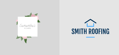
To enlighten you even more, here are some concrete suggestions of fonts available in FreeLogoDesign, to use in your logo, according to your type of business
- For a florist or a company in the field of wedding services, script fonts like Pacifico, La Belle Aurore or Zeyada will be perfect to represent the sweetness and femininity associated with the company.
If your business is more corporate or serious, a simpler and neutral font like Esteban or Cinzel would be ideal. Otherwise, in the same style, but giving a more humane or accessible side, we have the Montserrat and Raleway fonts, which are two sans-serif fonts that look more human. They are also very modern, so ideal for tech companies.
FREELOGODESIGN DIFFERENT FONT CATEGORIES
In order to help you when creating your logo, our team separated our available fonts into six categories: Modern, Storybook, Poster, Handwritten, Futuristic, and Rounded. It is then easier to try different fonts according to what you have in mind. Do not worry; you will surely find a font that meets your needs. Indeed, on FreeLogoDesign logo maker, you have access to more than 300 fonts! Some are serif, others are sans-serif, decorative, or script. On your logo, on only need to click on the text to see the different font options appear on the right.
Hopefully, this little guide will help you pick the best fonts for your logo, good luck, and happy logo creation :)
More tips and tricks on the blog

