Blog

The Amazon Logo Story
What is the inspiration behind today's corporate logos? What did their original emblems look like? Some companies have had several logos over time, while others have remained stable. Today, we're taking a look at the history of Amazon's logo, one of the most important online stores of all time. Despite what you may think, Amazon has had more than one logo over the course of its existence. Let's take a closer look.
A few words about Amazon
Now one of the giants of the retail industry, it goes without saying that Amazon has quickly carved out a place for itself among the most influential brands. This online store company was founded in 1994 in Seattle, and was called "Cadabra" at the time. However, the name was changed because it sounded too much like the word "corpse." Initially, Amazon was only selling books online, which allowed them to grow very quickly, generating a revenue of over $20,000 per week in the first two months of operation. By always investing their profits in the company, they were able to grow very fast and become one of the biggest players in online business as we know it today.
Why did Jeff Bezos choose the word Amazon as a company name?
First of all, why did Jeff Bezos choose the word Amazon? It’s simple. He wanted a word that began with "A" so it would come up first in alphabetical searches. In addition, he liked that the word Amazon represented the Amazonian forest and its wild and exotic side. He also wanted to emphasize that he had a library of books as vast as the Amazon River located in South America.
Amazon's first logo: when was the Amazon logo created?
In 1995, Jeff Bezos wanted to create a logo for Amazon that represented his vision. He decided to use a background that was blue like a river with the shape of a trapezoid forming the letter "A" and the Amazon river or a forest path crossing the trapezoid.

During the next two years, a black and white version appeared as well as a "zebra" version, which existed only one year.
There was good intention behind wanting to incorporate the "A" in the logo, but the idea was poorly executed.
Amazon's logos over the years: who designed the smile logo?
Jeff Bezos decided to redesign his logo. He hired designers from the firm Turner Duckworth to design the perfect logo. In 1998, two more logos were created. The first was more refined, with the website name "amazon.com" accompanied by the slogan "Earth's Biggest Bookstore" in black serif font. This logo seemed too serious, so for the second version, they added a little color by making the "O" yellow.
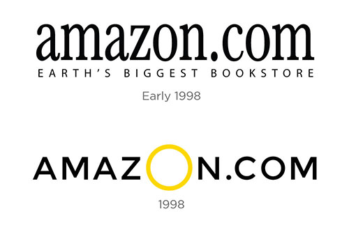
A new logo, closer resembling the one we know today, was used between 1998 and 2000. This logo introduced the yellow/orange curved underline, emphasizing the word Amazon.
What does the Amazon logo symbolize?
The current logo was introduced in 2000, changing the yellow curve slightly to represent both a smile and an arrow, which goes from A to Z. Even through the many iterations, Jeff Bezos has kept all of the original elements of the logo. The "A" and the river or path are all still present. The logo also still shows that he offers a huge diversity of products from the letter A to Z. He is showing that on his site you will find everything you need and with a smile, efficiently. Bezos was able to preserve the original meaning while simplifying his logo.
The Turner Duckworth agency noted that it was a fairly quick branding project since Jeff Bezos attended all the meetings and approved everything himself. By doing so, he was able to save costs by cutting down on marketing research, approval meetings, and revisions.

We also need to mention that Jeff Bezos, being very cost conscious, did not want to pay for other branding elements or packaging design. Turner Duckworth proposed using the yellow arrow alone as a visual for the shipping boxes, turning the boxes into "smile boxes." This decision allowed the boxes to be used as a marketing vehicle and to give a good impression of the company during the millions of monthly mailings, thus allowing them to "deliver smiles to your door."

What fonts are used by Amazon?
Do you know what fonts are currently used by Amazon's brand? In fact, there are more than one. The font Amazon uses for its logo is Officina Sans Bold; however, this company also created another typography, Amazon Echo, for other elements of its brand.
What we like about the Amazon logo
There are many reasons why we believe that Amazon has an effective logo. First, it is a wordmark logo that is both simple and flexible. It can be used everywhere, whether on its online store or packaging. Amazon also has a wide brand universe because of its several products. Whether it is the Amazon Prime, Music, Kindle, or Aws logo, customers can easily recognize this company's brand. Also, they are a great example of how a company can use packaging to promote their brand.
Finally, the arrow has become a branding element as recognizable as the logo itself. This is a good example of the importance of logo versatility. Do not hesitate to modify your logo to best represent your company and continue until you find a logo you like. Even if it means changing your logo at least seven times in 5 years, like Jeff Bezos, before finding the one that works for you and the company.
More tips and tricks on the blog

