Blog

Different Types of Logos and Which One to Choose
Of course, when you're a small business, creating a logo is a big step! It may seem beyond your skillset if you do not know much about graphics. Before you start designing your logo, it is important to analyze your needs. How will you make use of your logo? There are several types of logos and each one has connotations, advantages and disadvantages. Each of these logos are suitable for different companies and their needs. Once you are familiar with these 5 types of logos, you can then start creating yours in a more informed way.
Monogram
The first type of logo is the monogram, which uses the first letter(s), or an acronym of your company name to makeup your logo. A monogram is actually a logo consisting of one or more letters. It's a perfect way to simplify a logo for companies that have a slightly longer name. Several types of companies use a monogram in their logo, for example: technology companies and car brands. The fashion industry uses the monogram the most which is why the monogram is often considered more upscale.
This type of logo is perfect if it is displayed in a square or very small format. Its simplicity will remain legible. For example, in a favicon, a social profile picture or a business card.
Example logos: Louis Vuitton, Gucci, General Electric, LG, NASA
Signature
The second type of logo is the signature. This type of logo only uses the name of the company to make a typographic logo without a symbol. These logos can be used in just about any field or business, but work much better for companies that have a fairly short name.
It can be intimidating to create a signature logo when you are not a designer, since it can quickly look like a word without personality. That is why it is important to choose the font that expresses the values of your business, while making the logo distinct. When creating a signature logo, play with colors as well as the spacing between the letters for a professional result.
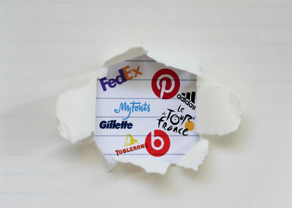
Example logos: Google, FedEx, Visa, Canon
Symbol
The symbol logo is another extremely popular type of logo. It is a logo without text and where the brand is represented only by a symbol. With major brands like MasterCard, Apple or Shell, using only one symbol to represent their brand, you may think this type of logo is the key to success. But when you're a small business, it's very daring to create a symbolic logo, since it can be very difficult to recognize your brand. Large companies can do it since they are already well known. Most of them started with a combination of a symbol and a signature logo. They made the decision to remove the text once they knew that consumers no longer needed to see the name of the company to be recognized. As a small business, it is a good idea to create a combined logo (explained below), to ensure company name recognition.
Example logos: Apple, McDonald’s, MasterCard, Shell
Combined Logo
A combined logo is a combination of a signature and a symbol or monogram. Also used by many large companies, this is the most flexible type of logo. It allows you to have a pictogram and a text that you can use in many ways. When you have a combined logo, you have the freedom to use your logo and your signature independently. This gives you more than one resource to work with.
When creating a combined logo make sure to connect the text to the image. You should incorporate the typography so that it contrasts and aligns with your symbol or monogram. Try several different layouts: vertical, horizontal or in a shape like a box.
Example logos: Amazon, Microsoft, Adidas, Lacoste
Badge
Badge logos are logos where the name of the company is included in a shape along with a symbol and/or slogan. The text is often curved. The shape gives the logo a label look, which gives a vintage connotation to your brand. That is why this type of logo is often used in sports, restaurants or bottle labels. Keep in mind that you don’t have a lot of flexibility with a badge logo as it becomes somehow trapped inside the shape.
Example logos: Starbucks, Warner Brothers, Vans
In reality, there is not one type of logo that is the best, since everything depends on your area of business. Think about how you want to make use of your logo. If you have an online application, your logo will have to look good in a small square and as a thumbnail on your application. But if you plan on creating a business like a distillery, keep in mind that your logo may be printed on hundreds of labels. In this case, your needs are very different. If you have several different uses, it may be worth creating more than one version of your logo all the while keeping the same visual identity. This way you can create multiple versions: a horizontal, a vertical, and a square for example. Then you can choose the best logo for the situation.
More tips and tricks on the blog


