Blog
The Evolution of the Pepsi Logo
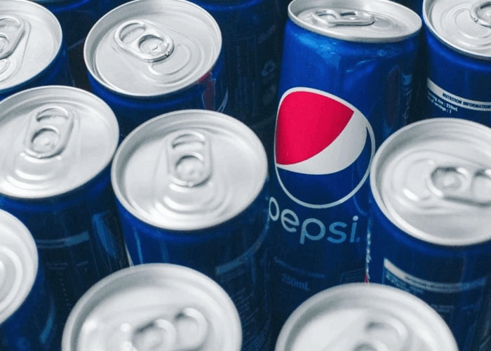
As we know, the food industry is very competitive. It is therefore imperative to have a strong brand image to stand out from your competitors. Few companies can claim to be 100 years old and still successful. Among those companies is Pepsi with its blue, white, and red logo. Let's take a closer look at the history and evolution of the Pepsi logo.
A Few Words About Pepsi
Founded in 1898 by a pharmacist, Pepsi, also known by its former name Pepsi-Cola, is an American company. Initially, the famous beverage was supposed to help with stomach problems, but when added to sparkling water, it became a popular drink. Although the company had some financial problems in the 1920s and 1930s, it quickly broke into the international markets and innovated by launching a range of products, including its famous Diet Pepsi and 7Up. Since then, Pepsi beverages have often come in second place behind Coca-Cola, except in a few countries. However, that does not change the fact that this multinational company makes several billion dollars a year.
Pepsi is a company that, much like Puma, has done a lot of major marketing campaigns with celebrities in recent years. Unlike its rival, Pepsi is not afraid of redesigning their logo, for better or for worse.
Pepsi's First Logo
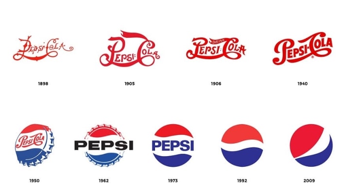
Every new product needs a strong logo and Pepsi's first logo is representative of its time. We only have to think of Ford's first logo and even that of Cola-Cola to see that the main trend of these years was the rounded lines with as much detail as possible – just the opposite of current trends! For Pepsi, in the hopes of standing out, many decorative elements were added to the letters – to the point where it was difficult to read the name of the company. The main colour chosen was also red. Fortunately, this version was only used for a few years. A new version was created in 1905.
Source: Huffpost
The Various Redesigns Over the Years
In 1905, Pepsi-Cola bet on its first redesign. This logo, which was used briefly and was mostly simplified. Pepsi said farewell to those decorative elements and arabesques. The whole thing was much more readable and easily reproducible.
In 1906, a new redesign of the Pepsi logo was born. The result was much more reworked. There was balance between the decorative elements and the legibility of the logo. The letters were thicker, and the serifs were both simplified and accented. The Pepsi-Cola name was then presented slightly skewed, making it dramatic. As well, the word ''Drink'' was added to the top of the logo, suggesting that people should drink Pepsi-Cola. This version would be used for 35 years.
At the end of the war, Pepsi regained its stability and gained market share. In 1940, the company ordered a new version of their logo. Again, this was a simplification of the original logo. This time, the serifs were cleaned up a bit more, resulting in a quite modern look. Ten years later, Pepsi adapted its logo to be used on bottle caps. Blue was added to the logo at the bottom for the first time and red was added at the top. This was the beginning of the use of blue, red and white in Pepsi logos, an important element to stand out from the brand image of its competitor Coca-Cola.
1962: Change of course! New decade, new ideas. This time, the name of the company was changed to be only Pepsi. They said farewell to the arabesques and serifs. This time the 1963 Pepsi logo got straight to the point. The name of the company was in black with a thick sans-serif font. In the background was the famous bottle capsule with a red wave above and a blue wave below. This was not meant to make people think of the symbol of yin and yang.
And what did Pepsi do in 1973? A new redesign! The 1962 logo was further simplified, and the black was replaced by a dark blue. It was from this moment that blue would become the most present color on the Pepsi logo. The capsule elements disappeared in favour of a simple white circle that acted like a contour. In 1987, the font was also slightly modified.
The year 1991 marked the end of the USSR, but also a new logo for Pepsi. Many elements of the old logos were reused, but in different ways. First, the name of the company was displayed outside the circle. A red bar was located below and to its right was the Pepsi symbol – a blue, white and red circle. The whole thing was an energetic look. This logo did look like it could have been used by a company associated with tennis. Not long after, the red rectangle disappeared, and a 3D look was given to the circle, an element that would be amplified over the years. Depending on the versions, the lettering would be blue with a white shadow, while on others it would be the other way around.
In 2008, we saw a major redesign of Pepsi's brand image, more than a hundred years after the company's creation. For starters, we said goodbye to 3D effects for a new combined and simplified logo. On the left, we saw the symbol of the modified capsule at a different angle. There was no longer a balance between colours. On the right, the company's name was in a custom-made font. Rumours were that the overhaul cost Pepsi a million dollars, but few people consider this logo a success. Let's see how long this American company will go without a new redesign!
Source: Medium.com
Update: a new logo for 2023
As we know, retro has been a major logo trend in the last few years. Pepsi decided to leap into this by doing another rebrand. This time, they went back into the past to find inspiration, more precisely, in 1973. Their 2023 new logo is an update of the 1973 version. Strangely, it looks more Pepsi than the latest version. We hope Pepsi finally found what they were looking for and they will keep this look for a while.
In conclusion, few companies have had as many logos as Pepsi. Pepsi has often sought to reinvent itself and has often had the audacity to change their logo to keep up with current trends. Here are two important points to remember when creating your logo: know how to stand out from your competitors with a brand image that is unique and do not hesitate to redesign your logo if you feel that it is no longer up to the task. Enjoy creating!
PS: Did you know that the word Pepsi comes from the Greek word pepsis which means digestion?
More tips and tricks on the blog
