Blog
The Meaning of the Cadillac Logo
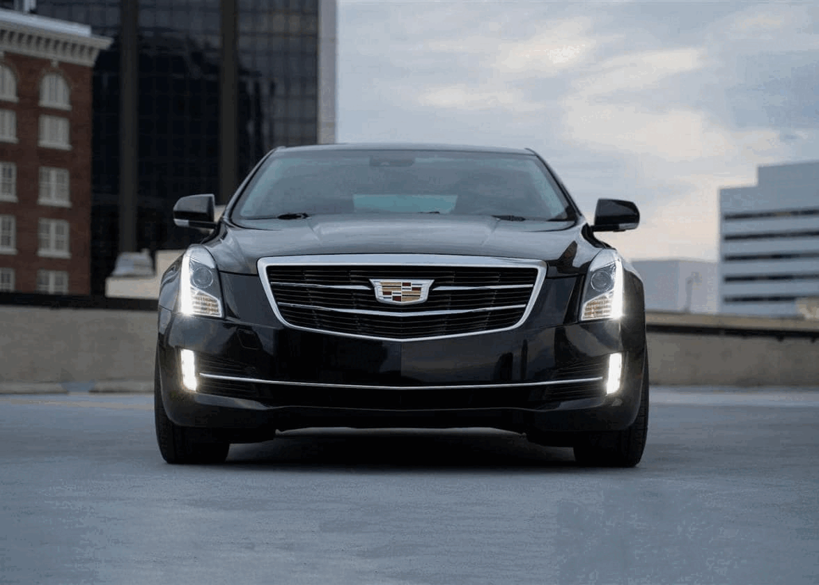
After studying the meaning of the logos of Ford, Audi and BMW, we wanted to know the history of another car manufacturer's logo with a strong brand: Cadillac. Did you know that this American company has had more than a dozen logos in its time? Do you know what the different elements mean that make up the emblem of which Cadillac is so proud? Discover the meaning of the Cadillac logo in this article.
A few words about Cadillac's history and cars
Cadillac is an American company specializing in the manufacturing of luxury vehicles. It has been owned by General Motors for more than 100 years. The automaker was founded in Detroit at the end of the 19th century and its name is directly inspired by the name of the city's founder, Antoine de Lamothe-Cadillac, who would remain one of the main inspirations for the branding over the years. As the automotive market was very difficult at first, Cadillac decided to stand out by offering vehicles with a clean appearance, although they were not luxury cars per se at the time. After the 1903 Auto-Show, Cadillac became a great success.
The company and its creations went on to win numerous awards, including the Dewar Trophy. In 1909, Cadillac was sold to General Motors. Then their expertise was used during the world wars during which the factories had to produce different parts for the war effort. Cadillac cars managed to weather the decades despite significant competition, and they continue to have a strong brand image to this day.
Cadillac's original coat of arms logo
Why are there ducks in the old Cadillac symbol? What does the badge emblem mean?
The first Cadillac logo is a very good example of the coat of arms logo. Actually, Cadillac's first badge logo design is based on the coat of arms of the founder of the city of Detroit and every element on it has meaning. First, a wreath sits at the top of the logo to show the noble origin of dear Antoine de Lamothe-Cadillac. Then, six ducks are present, three on each side, to represent the maternal and paternal noble lineage. Then there are horizontal lines and their colors have special meaning: black is associated with superiority, gold with wealth, red with audacity, silver with virtue and blue with value. Finally, the whole thing is surrounded by laurel branches, symbol of victory, and the company name at the bottom. In short, Cadillac's original badge emblem is basically quite complex, much more so than many of its competitors.
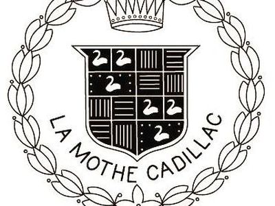
Source: Hemmings
The evolution of the Cadillac logo and crest
When did Cadillac get rid of ducks?
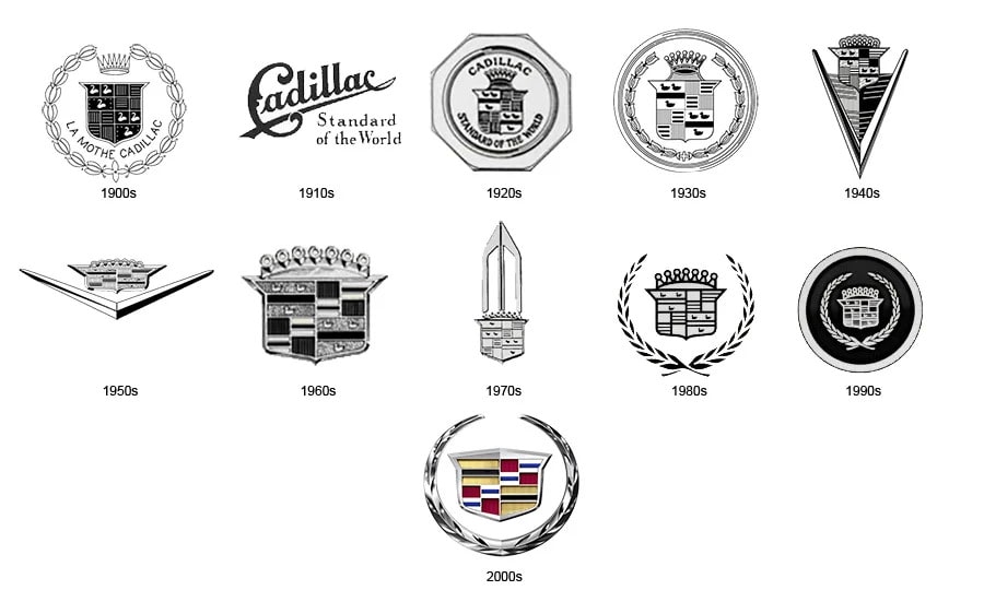
During its existence, Cadillac has undergone several logo redesigns. For example, in 1914, there was a version resembling the Pepsi or Coca-Cola logo using only the Cadillac name. From 1920 to 1933, the original logo was simplified and refined slightly by removing the company name. Then, from 1933, there were several very different versions and changes. For example, one redesign replaced the laurel branches with wings, while another gave a triangular shape to the logo. Keep in mind that logos had to look good in front of vehicles, especially when it came to luxury cars.
Source: AutoNews
In 1947, the Cadillac logo regained a bit of simplicity. The coat of arms was back with this time a big V underneath. Versions with the V were used until 1963, when a new simplified redesign of the Cadillac badge emblem was created and then used for nearly 40 years – the coat of arms with laurel leaves. In 2009, designers created an even more simplified version, the ducks disappear once and for all. A metallic and 3D look was also given to the entire logo design, which was a popular trend with several car manufacturers at the time.
The last Cadillac logo redesign was in 2014. The laurel branches disappeared again, and we keep the metallic effect and depth. Then the coat of arms was slightly stretched. Depending on the variation, the symbol could be used alone or as a logo combined with the company name in a distinguished font.
How to get inspired by Cadillac when creating your logo
Cadillac's history, name, and redesigns can be great inspiration when creating your logo. To begin with, feel free to draw inspiration from an element specific to your story or your region, as these are things that will make your logo unique. Cadillac has used the founder's hometown coat of arms to create its strong brand image. Then remember that colors have meanings. Cadillac decided to highlight the colors of the coat of arms, because they represented different values that it wanted to associate with its vehicles: superiority, wealth and audacity.
Finally, the trend of the moment for logos is minimalism. In recent years, several major brands have decided to remove the details of their logo to create something simpler. Cadillac is no exception. You don't need to add small superfluous items that will be not very visible or that will make your logo difficult to replicate. The best example of this is the ducks that disappeared from the Cadillac logos from 2009. We don't think the ducks' design will be missed anytime soon.
In conclusion, BMW is not the only car manufacturer to use coats of arms for logo creation! Don't hesitate to try this type of logo for your company if you want to put forward your seriousness and professionalism. Did you also know that the famous Henry Ford also worked for Cadillac for a while? If you're interested in the automotive world, discover the story behind the Ford logo.
More tips and tricks on the blog
