Blog
The history and meaning of the Lacoste logo
In the world of fashion and haute couture, many of the brands known around the world are French. So far, we've had the chance to analyze the logos of Chanel, Louis Vuitton, and Yves Saint-Laurent. However, it is important to remember that not all companies of this kind opt for a monogram or signature logo. Let us tell you about the history and meaning of the Lacoste logo and its famous crocodile.
A few words about Lacoste
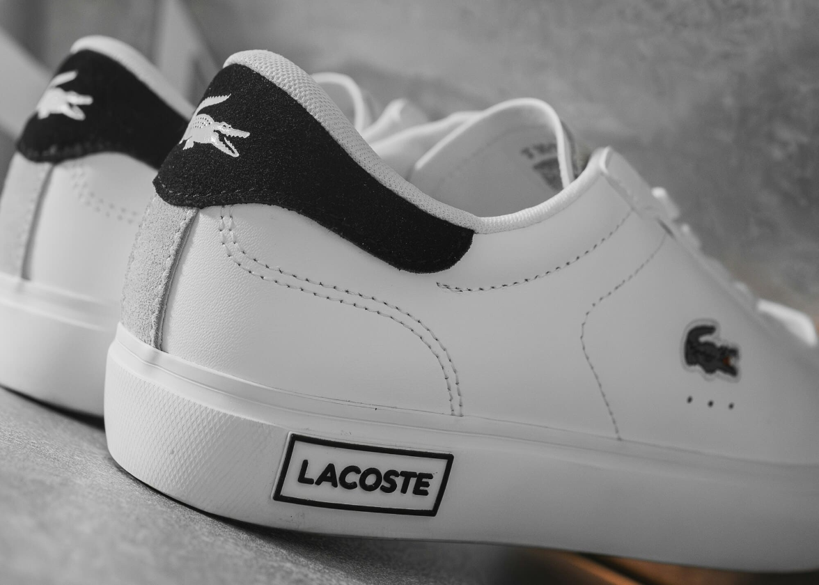
Founded in 1933 by René Lacoste and André Gillier, Lacoste is a French clothing company. Initially known for shirts made especially for tennis and golf enthusiasts, this brand has diversified by offering different types of clothing and accessories, and perfumes. Lacoste also has the particularity of being very recognizable since a crocodile is embroidered on the clothes, on the left side at heart level. Today, there are also Lacoste boutiques all over the world.
Why a crocodile as a symbol?
As we mentioned in the introduction, most French luxury brands have chosen to create a logo consisting solely of the company name. Why did Lacoste choose a crocodile as their emblem?
To understand this choice, you need to know the story of René Lacoste, one of the two founders. In the 1920s, René was a very successful tennis player. According to legend, during a tournament, he was promised a crocodile skin suitcase if he won. Unfortunately, René Lacoste was defeated, but the nickname remained. It was said that this French player had the tenacity of a crocodile when he was on the court.
It was the designer Robert George who created the brand's first crocodile emblem in 1927, and René Lacoste proudly displayed it on his shirts. Robert was one of the pioneers in this field.
Lacoste's first logo
Despite what you might think, Lacoste's first logo was different from the one we have today. The crocodile emblem was more realistic, had several details, and used a color palette that included mostly brown and yellow. At that time, the symbol was used alone. This version was used until 1984, when the company opted for further expansion.
The evolution of the Lacoste brand over the years
In 1984, Lacoste undertook a major overhaul of their brand image and began to use the icon we know today. Instead of relying on a realistic crocodile with many details, the brand decided to bet on simplification. A more flexible symbol is easier to embroider on different garments and accessories.
First, the reptile's silhouette is less complex. They kept only three colors, green, red and white. Another change was the use of the company name under the symbol. The Lacoste wording is placed under the crocodile of the same width. Also, like other French luxury brands, they opted for a thick sans serif font, both simple and elegant.
In 2002, changes were made to the Lacoste logo. The symbol was again simplified: some details of the crocodile were removed, including several white scales. Another major change was the proportions between the brand name and the icon. The mention of Lacoste took up more space. As for the font, it remained similar, although less thick. There was also more space between the letters.
Then in 2011, the logo was changed again. The space of the crocodile is again reduced to leave more room for the name. They also opted for a new font that was still sans-serif. However, the letters were thinner for a more refined look.
What font is used on the Lacoste logo?
You may be wondering what font was used on the current Lacoste logo. Unfortunately, this would be a custom-made font created by the company.
Even so, since it's a relatively simple sans serif font, it's possible to choose a similar typography when creating your logo. If you're using FreeLogoDesign, we suggest fonts like Open Sans, Lato, Lexend, and Ubuntu.
How to get inspired by Lacoste when creating your logo?
If you're looking for ideas for your logo, how can you be inspired by Lacoste? There is a lot to be said about this.
First, Lacoste was able to stand out by opting for a very unique emblem and by choosing a type of logo that was not really used by their competitors. Therefore, if you have a nickname or something that represents you well, feel free to use this as inspiration when creating your logo. Why not choose an animal as your emblem to stand out? As animals are associated with different values, this can help you have a strong message.
Now let's move on to color choices. The 1984 redesign introduced complementary colours that were easier to use. One of the advantages of complementary colors is the fact that their contrast attracts attention. It is therefore worth considering if you are looking for components to stand out.
In conclusion, Lacoste remains a timeless luxury brand. Although initially their clothing was exclusively for the sports world, over time they have been able to adapt and attack new markets. Today, the little crocodile remains a symbol of elegance, but also of performance. It is always with pride that the emblem is embroidered on various garments.
Would you like to learn more about the history of other luxury brands? Learn about the origin and meaning of the Ralph Lauren logo.
More tips and tricks on the blog