Blog

The 10 most beautiful new logos of 2024
In 2024, many companies and organizations are rethinking their brand image to show their evolution and connect more with their customers. Current trends in design and graphics play a key role in these redesigns, with styles that are modern, minimalist or bold, depending on each brand's objectives. Here are ten new logos that illustrate the art of reinventing visual identities, while honoring the values and essence of each brand.
Sport and entertainment
The sporting and cultural worlds, both in Canada and internationally, have undergone many changes in terms of branding. Well-known companies and organizations have reinvented themselves to capture the attention of their audiences like never before. These bold redesigns perfectly blend current trends, aesthetics and originality.
Paris 2024 Olympic Games
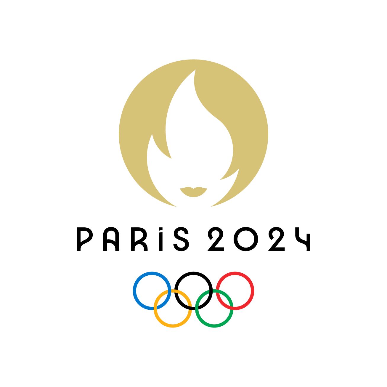
This summer, for the second time in the history of the modern Olympic Games, this major sporting gathering was held in the French capital. For the occasion, the Olympic Committee went to great lengths to create a logo combining three important symbols: the gold medal, representing the surpassing of self; the Olympic and Paralympic flames, icons of this event; and the Marianne, a figure well known to the French. This unique logo perfectly embodies the spirit and values of the Games, while following the minimalist trend.
Decathlon
This sporting goods chain modernized its brand image in 2024. As the company is located in 70 countries and regions around the world, it needed to make changes that would still allow the public to identify it with ease. Its designers therefore kept its easily recognizable typography, but added an orbit to create a combined logo. Decathlon wanted to represent a mountain, a sail, a wave and a heartbeat in a single shape, perfectly illustrating the diversity of products offered in store and online.

Toronto Raptors
The 2024-2025 season marks thirty years of the Toronto basketball team. To celebrate this anniversary, the organization redesigned its logo. Raptors fans will easily recognize the iconic ball marked with claw marks, which became the central component of the logo in 2015. This sleek, dynamic design pays homage to the team's roots, while highlighting how far we've come.
.png)
CBC Arts section
The “Arts” section of the CBC website is having a lot of fun with its logo! Each month, it introduces a new creation designed by a Canadian artist. During 2024, we were treated to a whole range of unique illustrations, always following trends to represent the time of year or current events. From gothic to plasticine to colorful murals, there was something for everyone! The design of this evolving logo shows how the use of shapes, varied materials and original typography can enrich a brand image.

Technology and the digital environment
With minimalist, stylized logos, these brands are adopting new visual identities that emphasize simplicity and innovation. These new designs reflect a trend towards modern, practical solutions.
Verizon
Telecommunications company Verizon refreshed its brand image in June 2024. It said goodbye to the red hook at the end of its name, keeping only this one and giving it vibrant colors. The objective behind this change is to better represent the meaning of the company's name, which combines two words: Veritas (truth) and Horizon (future possibilities). Following minimalist trends, this simple, modern logo reflects the dynamic energy of Verizon's customers.
PayPal
A good way to update your logo is to keep it simple. That's what PayPal did with its new corporate identity. The company has taken a more minimalist turn, following current trends in visual identity. The streamlined logo embodies ease and fluidity, reflecting the user experience that PayPal wishes to offer its customers worldwide.

DocuSign
DocuSign is a pioneer in electronic signatures and smart contract management. To coincide with the launch of this second product, the company has created a new logo. It now incorporates an icon representing the combination of the two products. The font has also been slightly reworked to add some liveliness. The brand's entire visual identity has been reworked to better represent the direction taken by DocuSign: that of being more modern and dynamic.
Automobile
The year 2024 marks a turning point for some automotive giants who, in tune with current trends, have reimagined logos unchanged for decades.
Lamborghini
Lamborghini's brand image has been the same for over twenty years. So, a logo makeover was welcomed! Like many in 2024, the company dropped the 3D effect applied to the bull, which can now be used in communications without the shield. The new logo symbolizes Lamborghini's innovation and determination, while remaining true to its iconic emblem.
.png)
Honda
It was in 1981 that the Honda logo was last change. In January 2024, the company unveiled the new visual identity of its all-electric vehicle line, to be launched in 2026. The iconic “H” was modified to drop the metallic look and integrate more dynamism into its lines. This sleek, futuristic design heralds the brand's electric ambitions.

Food
On the food side, there are fewer visual identity changes than in 2023. There is, however, at least one brand that revisited its logo graphics to give it a modern, trendy look, while remaining true to its roots.
KitKat
It's a modern retro-style logo that KitKat introduced to the American public in 2024. You can see that the font was modified to make the lines sharper, giving the impression that the letters could crack like the famous chocolate bars do. The emphasis on the circle was also reduced so that the main component of the logo is the brand name. This approach reflects a growing trend: revisiting the past to breathe fresh life into simple shapes. Otherwise, KitKat maintains its familiar logo, but this American version adds a vintage touch that will appeal to consumers.
These logo redesigns show how iconic brands are evolving to stay relevant and close to their audience. By following the latest trends in graphic design, you can also modernize your logo and transform your visual identity. Want to get started? Try FreeLogoDesign to create a visual identity that reflects your goals.
Roxane has always written and dreamed of making a living from her pen. Now a web editor, proofreader and author, we can say that it is mission accomplished!
More tips and tricks on the blog
